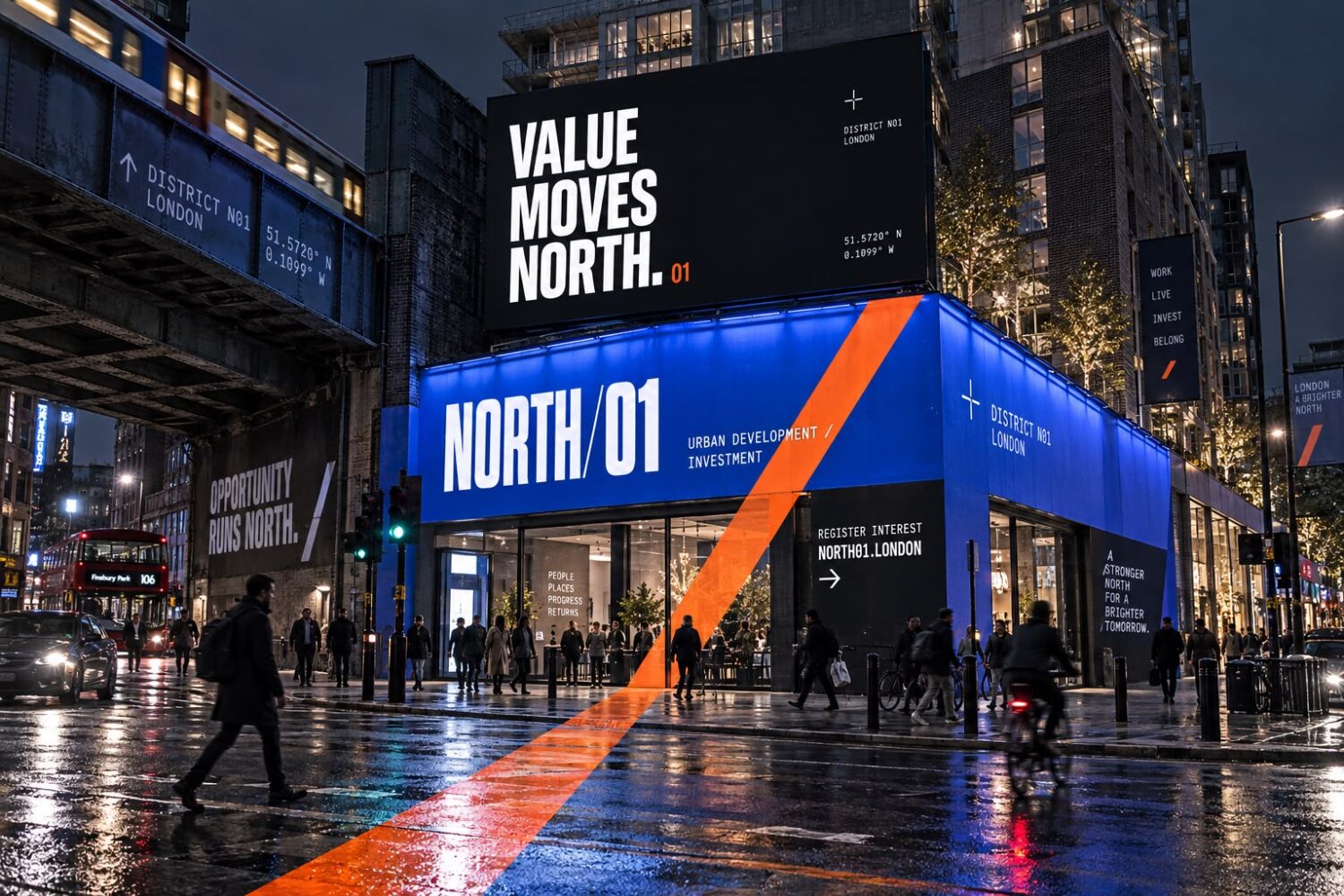
District identity
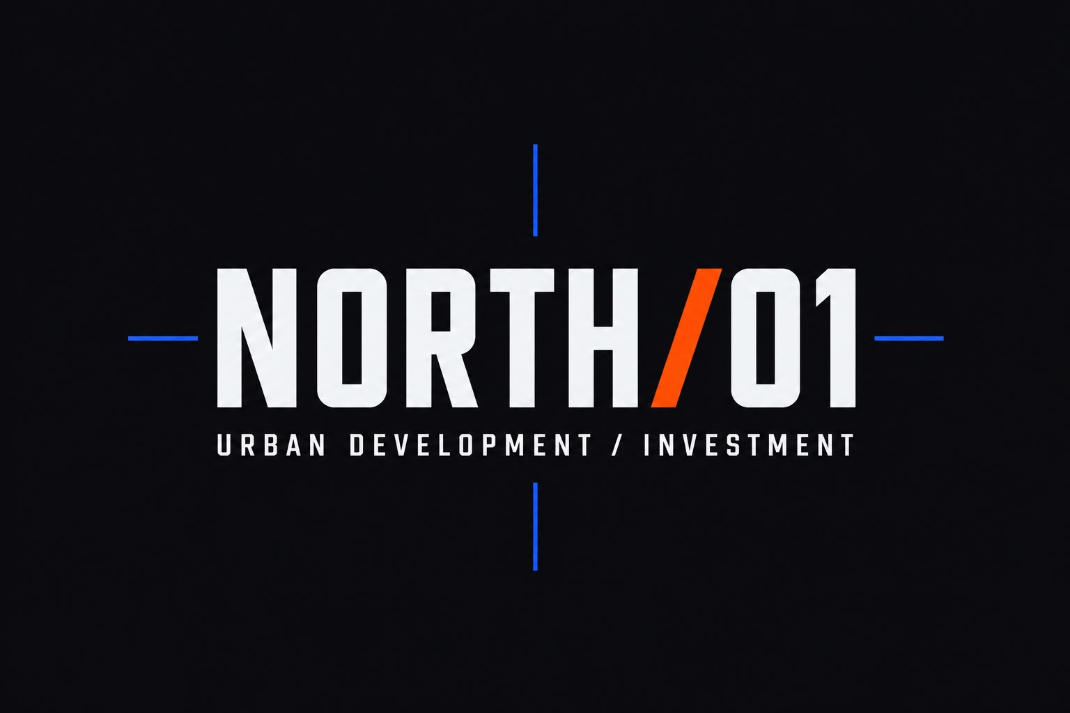
NORTH/01
Problem
A regeneration scheme has to sell an idea long before there is anything to look at. Investors are asked to commit to a district that currently exists as a hoarding and a set of drawings, and residents are asked to believe their postcode is about to change. The scheme had the funding and the planning behind it, but no single identity capable of holding a decade of phased construction together, and nothing that made the place feel inevitable rather than speculative.
Strategy
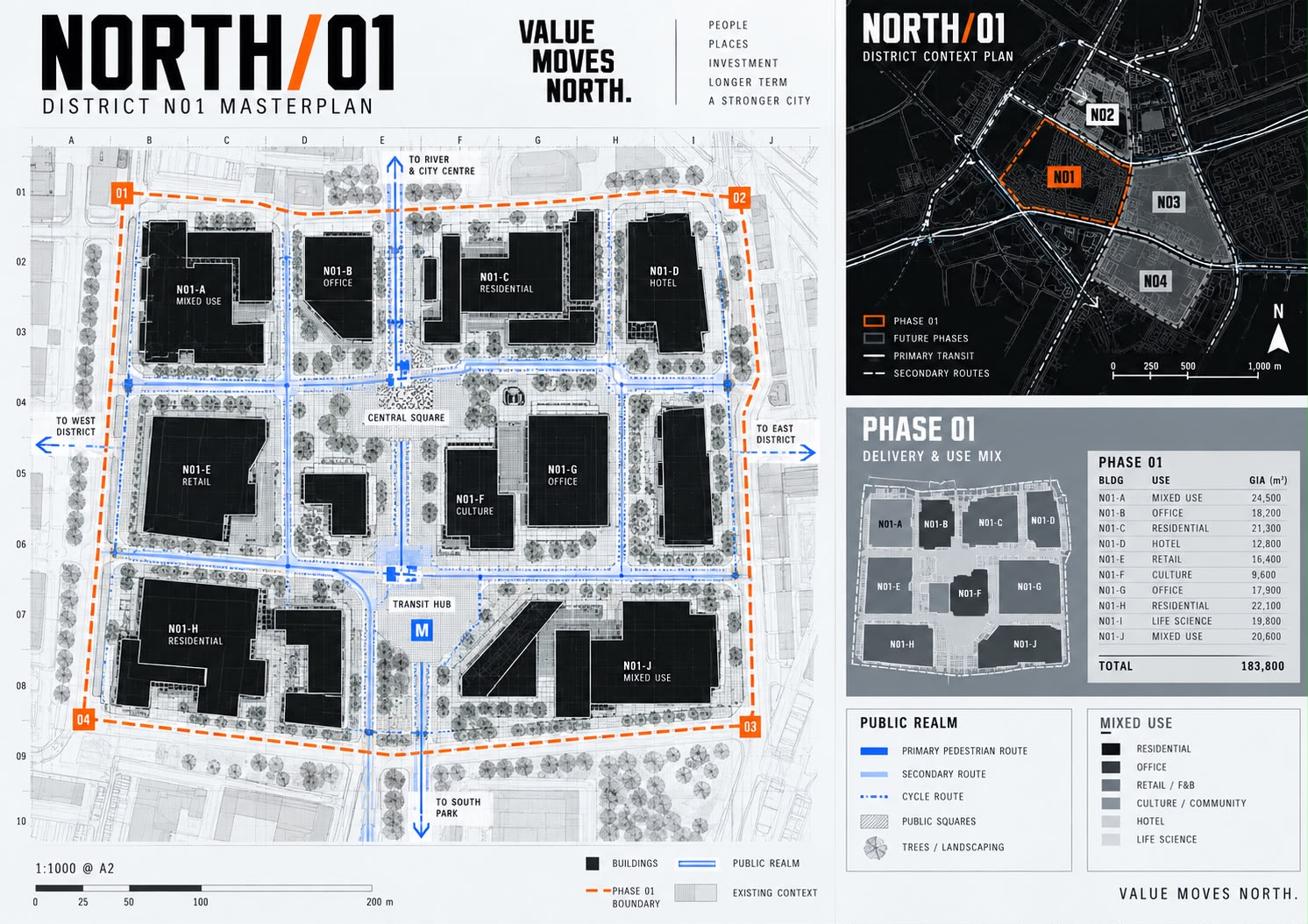
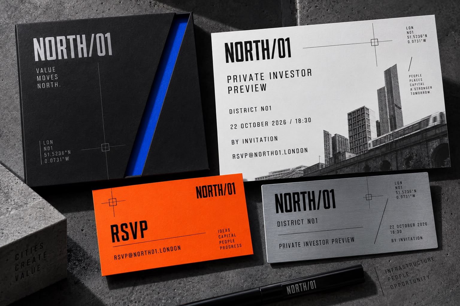
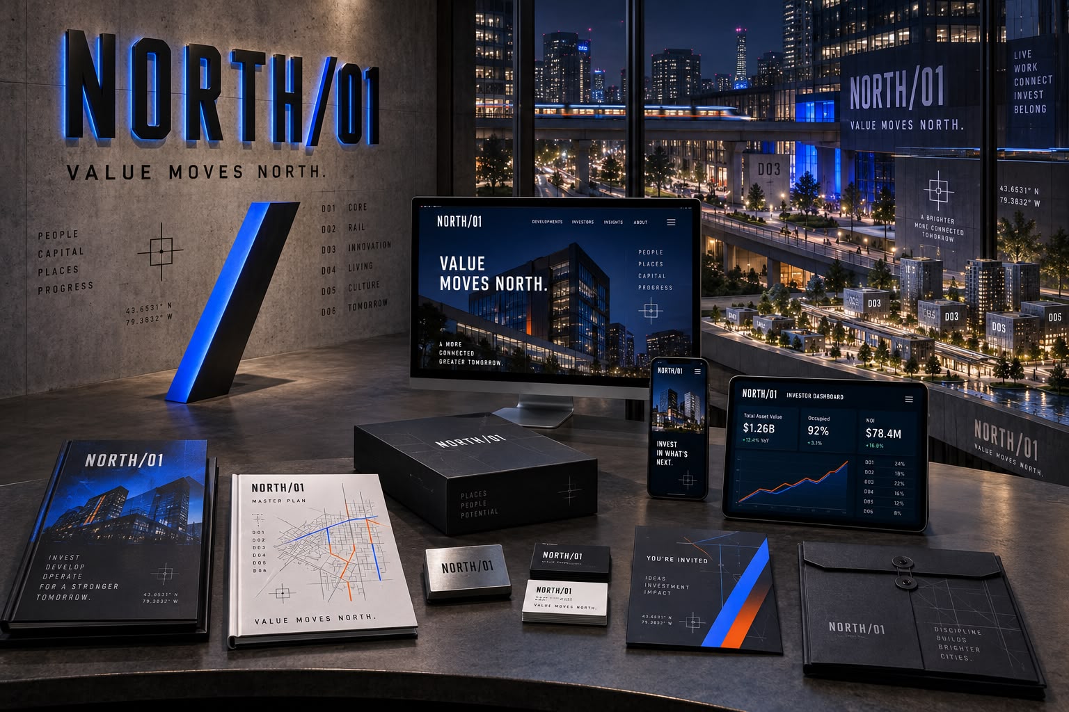
The identity is built on a slash and a number, because NORTH/01 is not a finished place but the first phase of one. The double-slash symbol carries the two audiences in two colours, and the phase number, district coordinates and registration marks give every piece a fixed address, so phase 02 needs new content rather than a new brand. The language argues directly, “value moves north” and “opportunity runs north”, because the job is to make a postcode feel inevitable well before there is much to look at. Blue and orange on near-black keep the scheme closer to civic infrastructure than to luxury property, which matters when the same brand has to hold up in front of a council, an investor and a resident in the same week.
What we built
- Primary logo
- Standalone wordmark
- Forward-slash symbol
- Colour palette
- Typography system
- Graphic language and patterns
- Photography direction
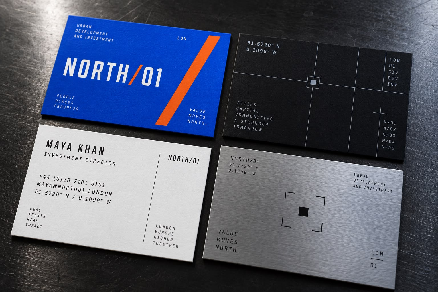
- Business cards
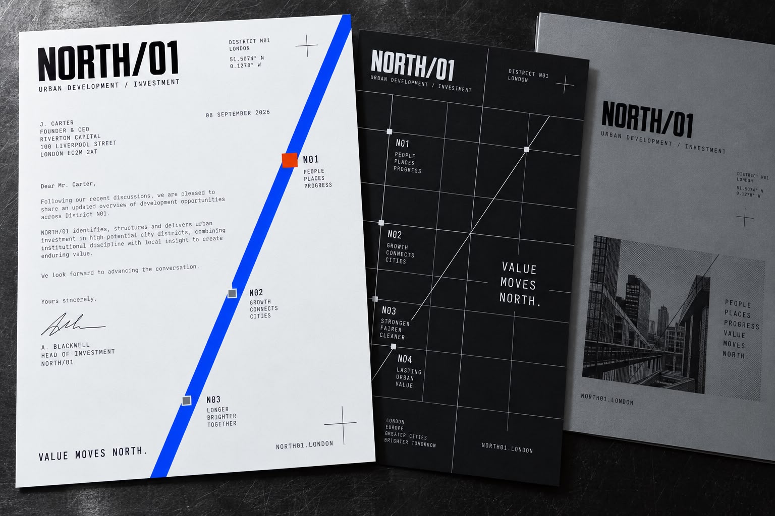
- Letterhead
- Branded envelopes
- Presentation folder
- Development brochure
- Investment prospectus
- District masterplan template
- Development specification sheets
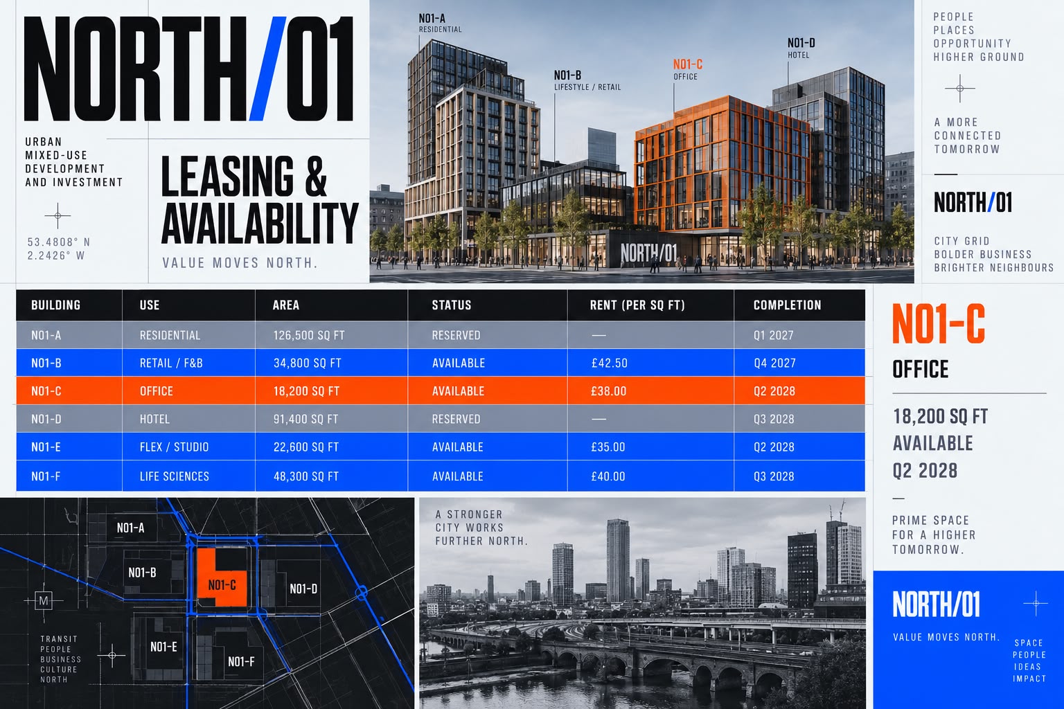
- Leasing and availability schedule
- Private investor invitation
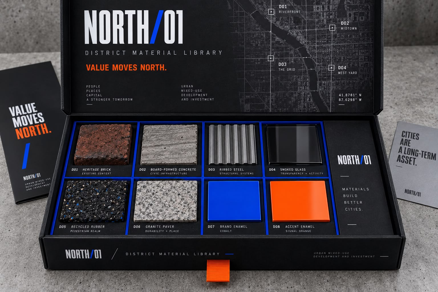
- District material sample box
- Branded document carrier
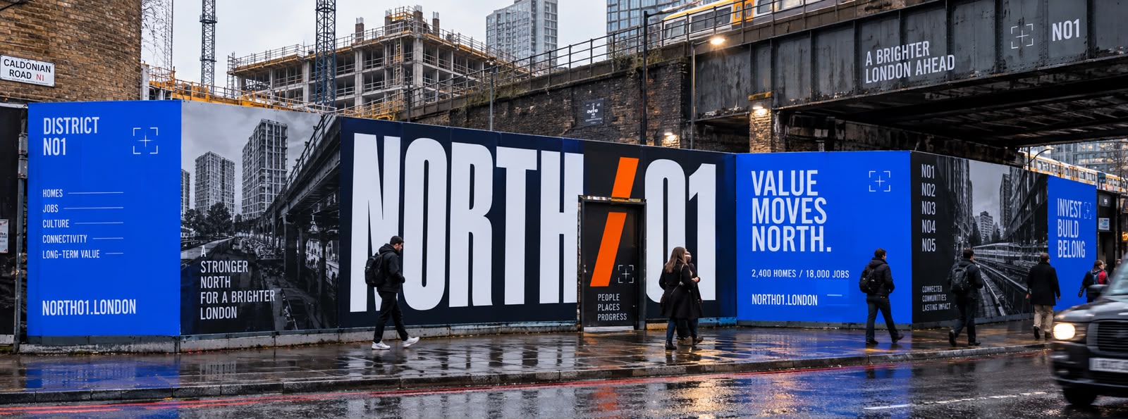
- Construction-site hoarding
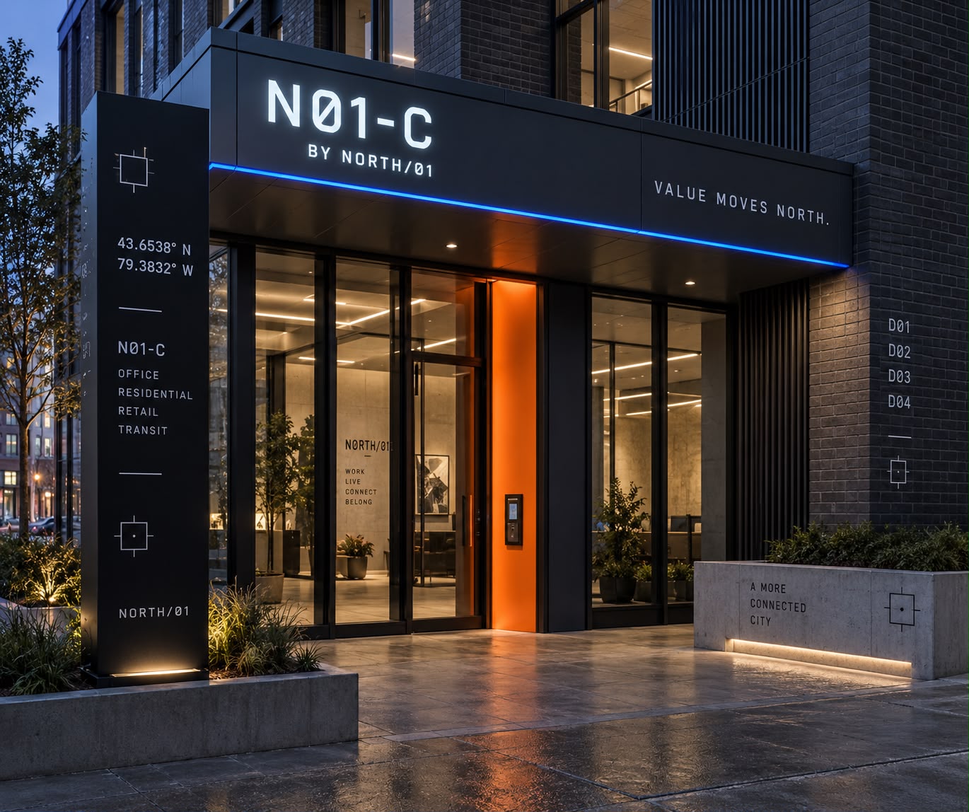
- District exterior signage
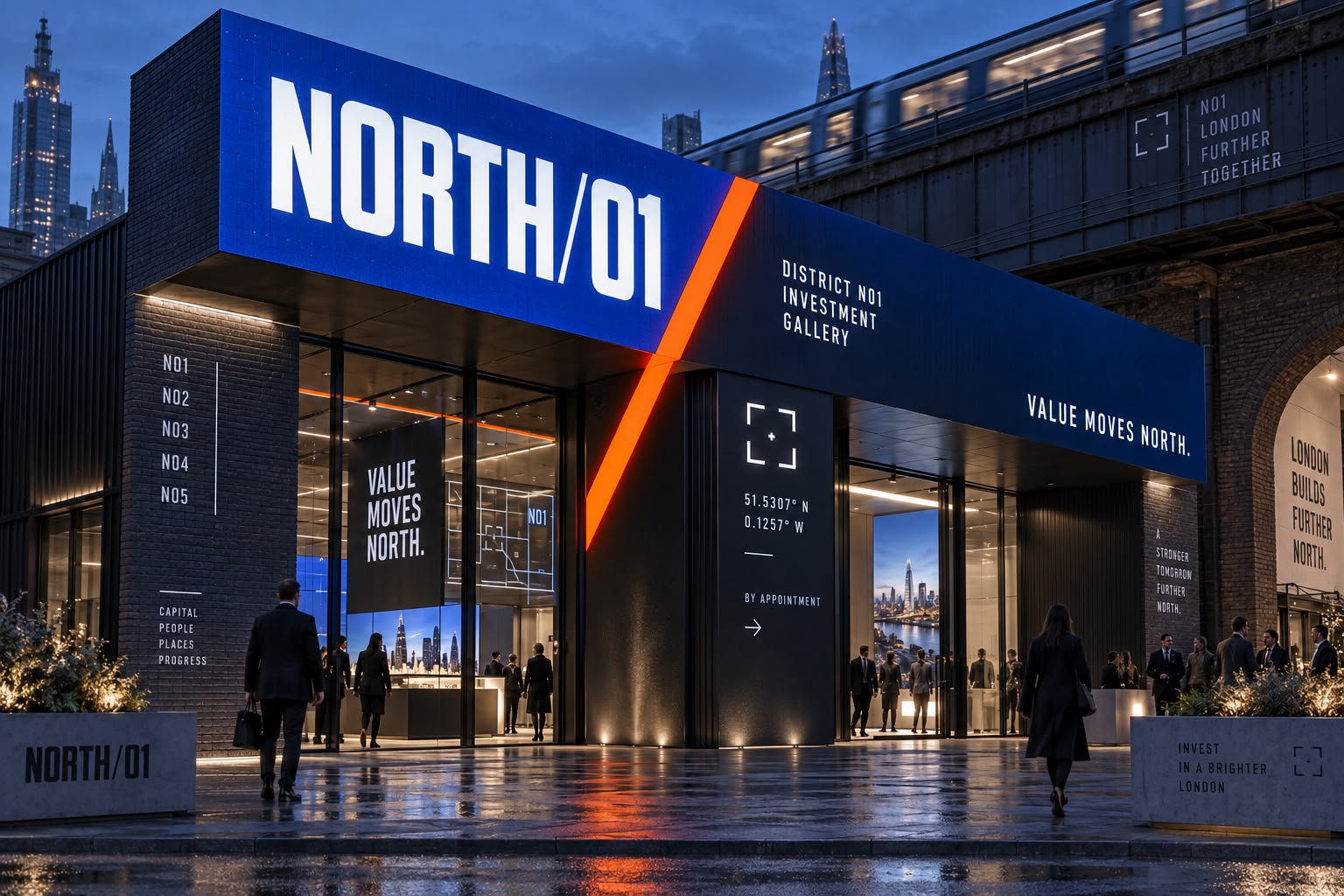
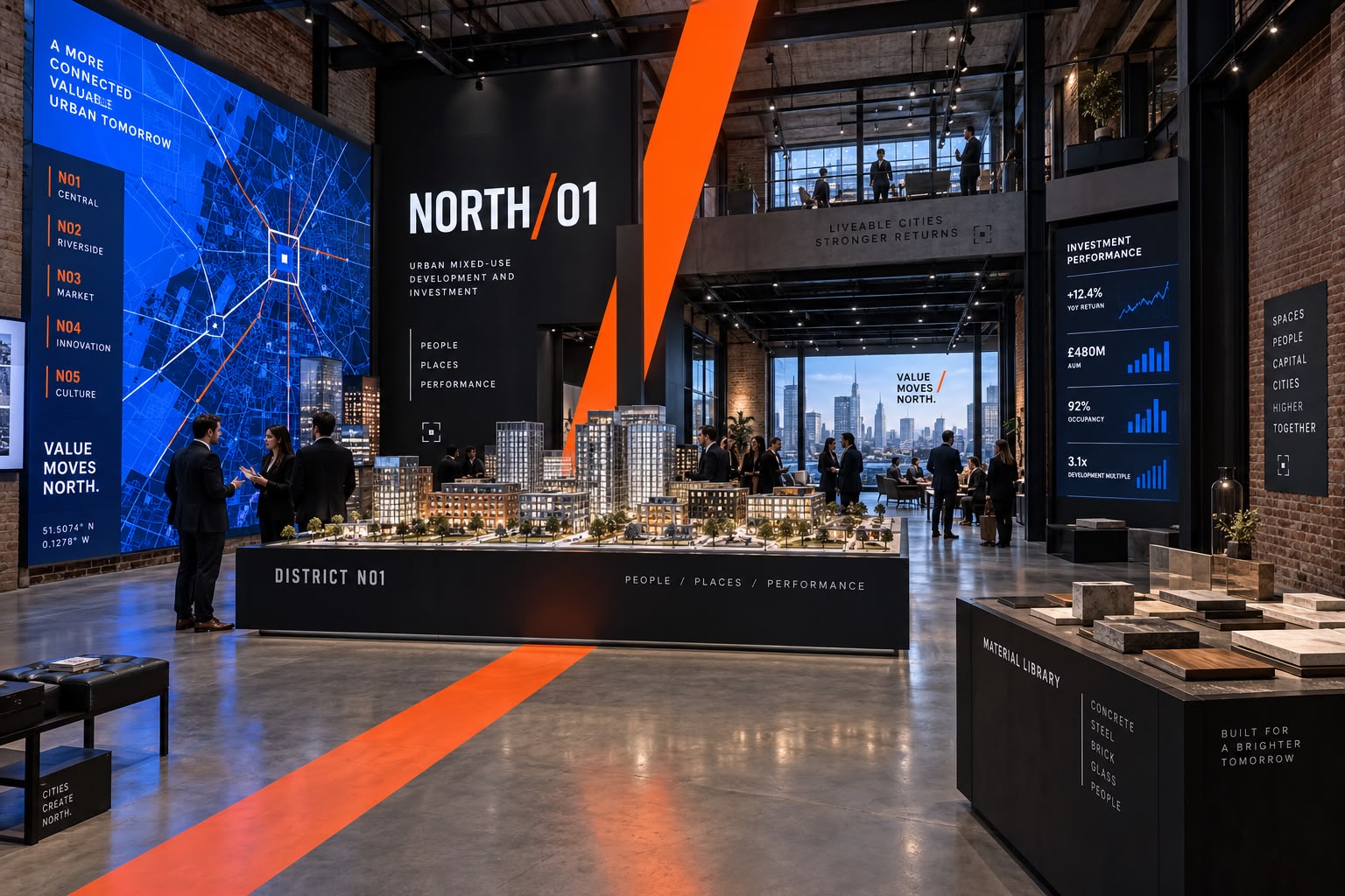
- Investment-gallery exterior
- Investment-gallery interior
- Permanent building entrance signage
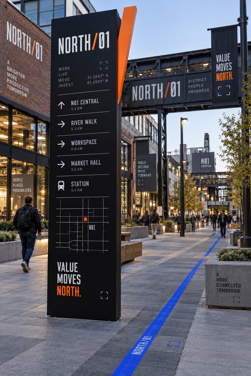
- Interior and district wayfinding
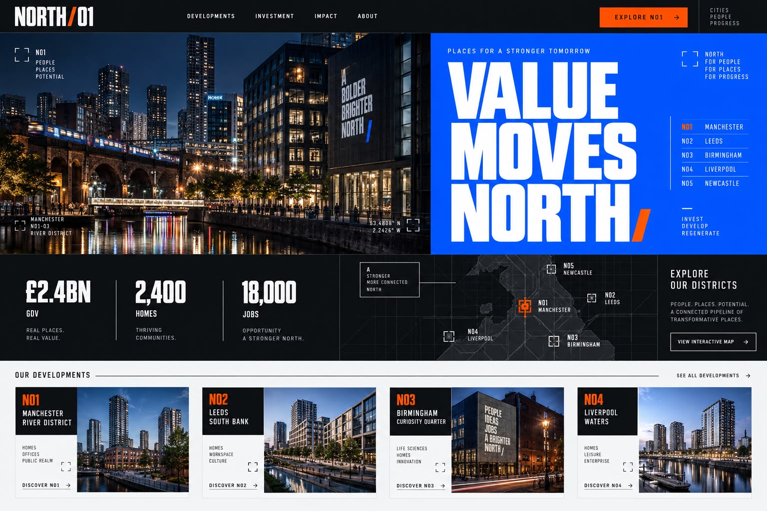
- Website homepage (desktop)
- Website homepage (mobile)
- Investor dashboard
Brand system
- Electric Blue #155CFE
- Signal Orange #FE5B0A
- District Black #0A0B0F
- Paper White #EFEFEF
- Typography
- Heavy condensed grotesk for the statements, a plain sans for information, and monospaced type for coordinates, phase numbers and investment data.
- Graphic language
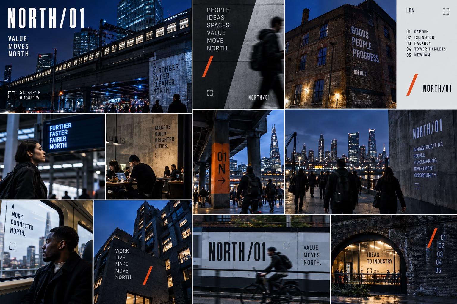
- The double slash used three ways: as the symbol, as a diagonal cut across a hoarding, and as a divider in text. Registration crosses, district coordinates and phase numbering give every piece a fixed address.
- Photography direction
- Real London streets after dark and in the rain, lit by the brand's own blue and orange. People in motion rather than staged residents.
- Symbol
- Two parallel slashes, one blue and one orange, split by a white square. It reads as movement north and as a phase divider, and holds from a building wrap down to a favicon.
The work









Result
The scheme now runs on one system, from the street to the spreadsheet. The double slash works at the size of a building wrap and at the size of a favicon, the coordinates and phase number give every piece somewhere to sit, and the investor material and the public material argue from the same identity without reading like the same document. Because the numbering is built in, phase 02 needs new content rather than a new brand.