Property development brand
FORMA
Problem
Developments in this bracket all say the same things: considered, crafted, elevated. The effect is that buyers cannot tell one scheme from another until they walk into the sales suite, and by then the agent is doing the work the brand should already have done. FORMA needed an identity that made the argument early, on the hoarding and in the brochure, so that a visit confirmed a decision instead of starting one.
Strategy
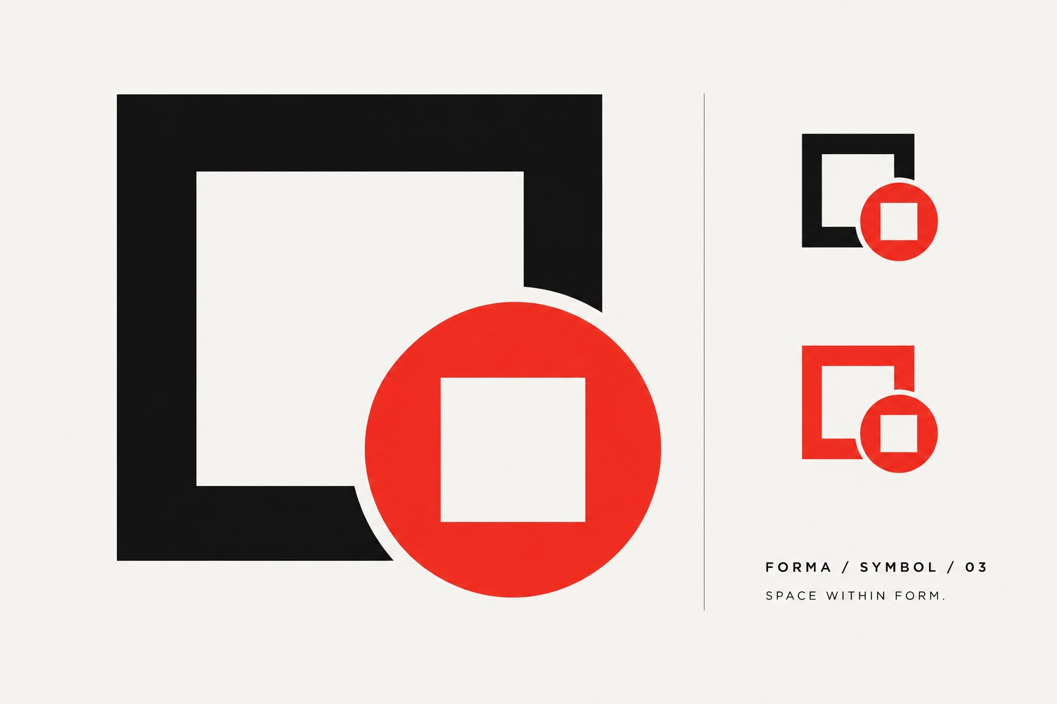
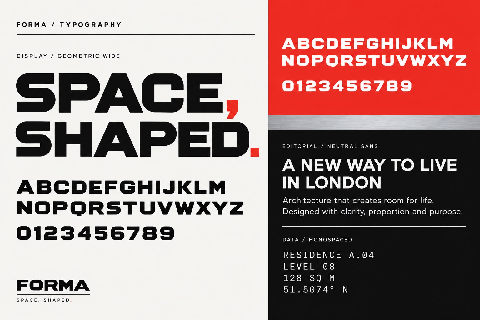
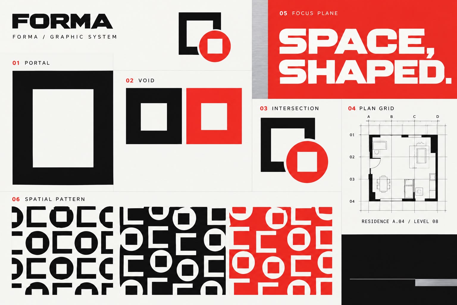
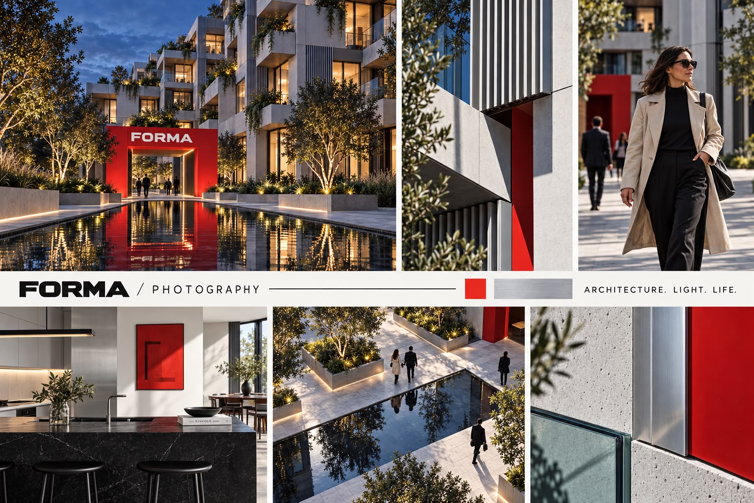
The identity resolves around a single idea: space shaped within form. An abstract square frame and intersecting circle meet at a central square void, and that void returns as the “O” of the wordmark with a scarlet alignment marker beside it. Everything downstream follows from it , bold geometric display type to carry the argument, a clean editorial sans to be read, and precise monospaced setting for property data, so a floor plan, a price list and a construction hoarding all speak in one voice. Photography holds the same line: architectural geometry, real residents, sculptural light, material detail and controlled scarlet focal points.
What we built
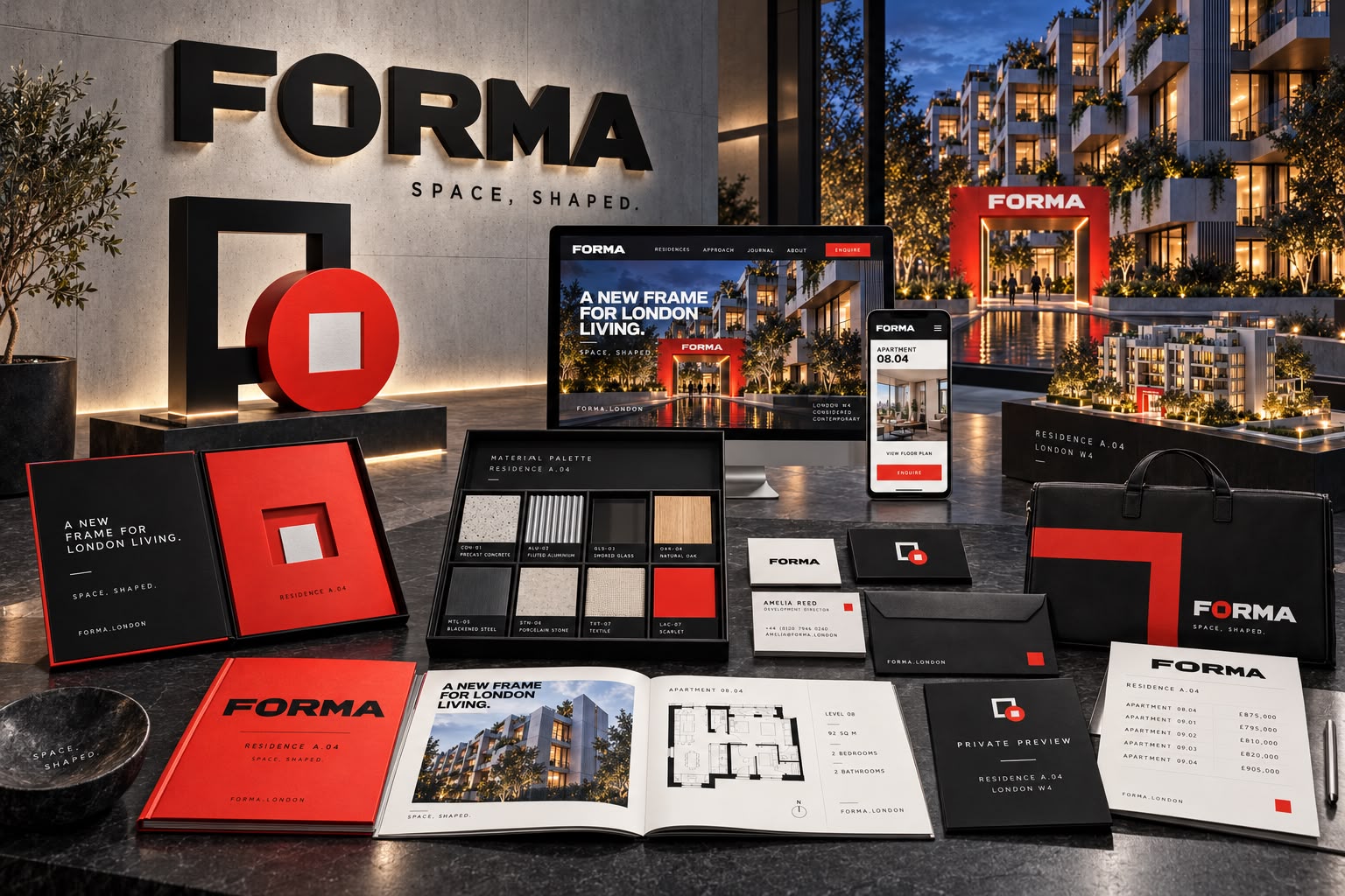
- Standalone wordmarkA clean architectural-black wordmark featuring the distinctive square-void “O” and scarlet alignment marker.
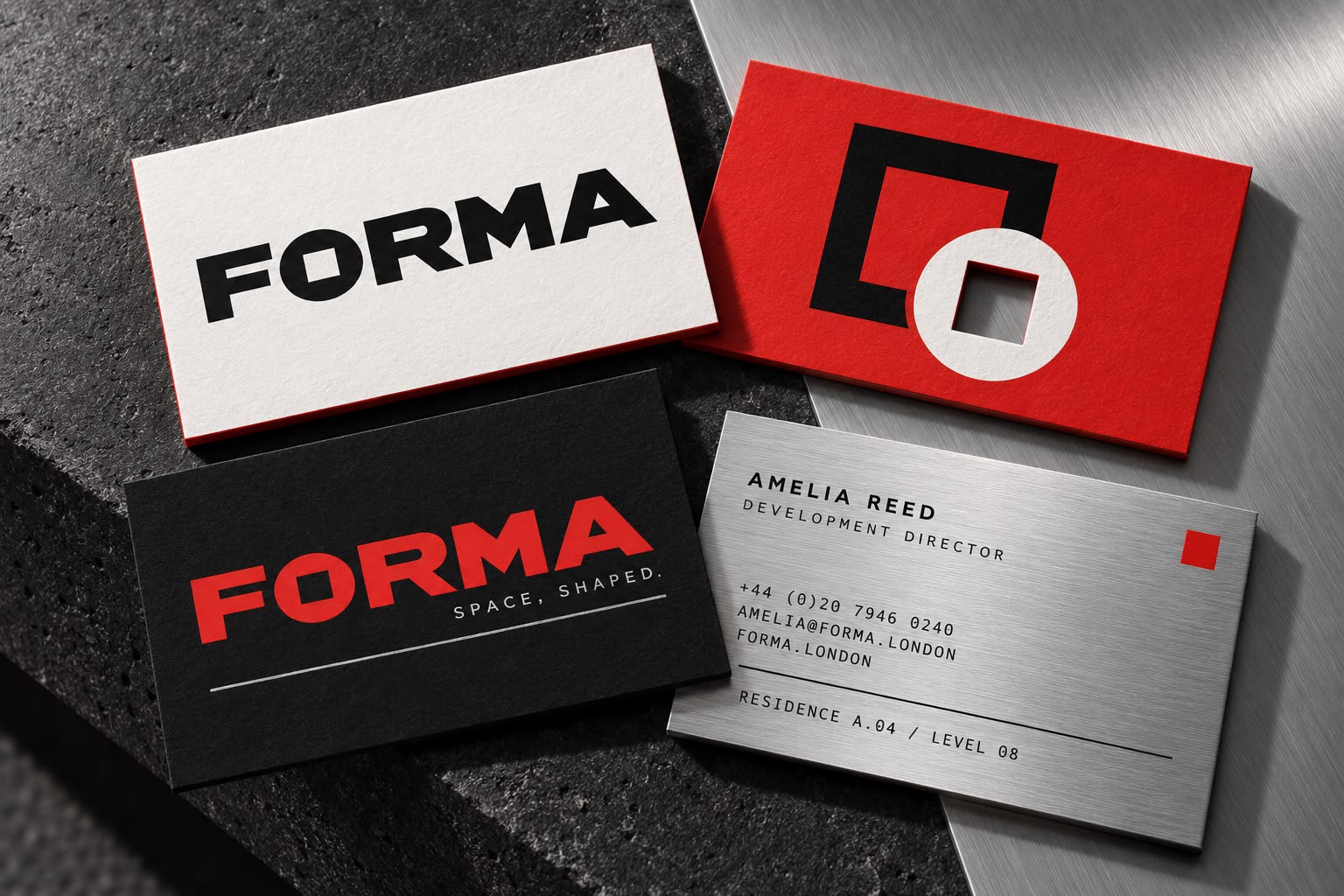
- Business cardsTactile uncoated and brushed-aluminium cards with scarlet edges, architectural geometry and precise property data.
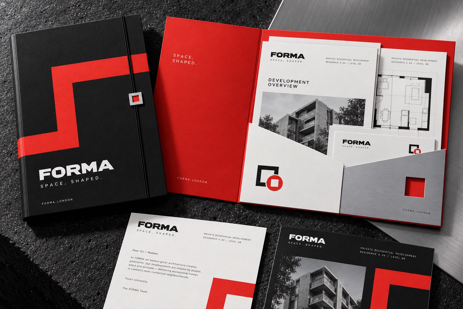
- LetterheadA precise architectural stationery system using scarlet framing, cool-white textured paper, aluminium details and structured typography.
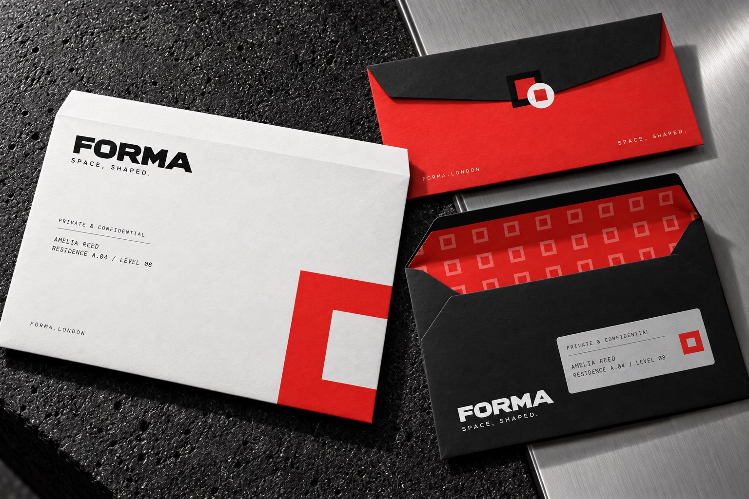
- Branded envelopeA coordinated envelope collection with bold scarlet portal geometry, patterned interiors and precise confidential addressing.
- Presentation folderA premium black-and-scarlet folder with architectural pockets, square-cut details and coordinated property documents.
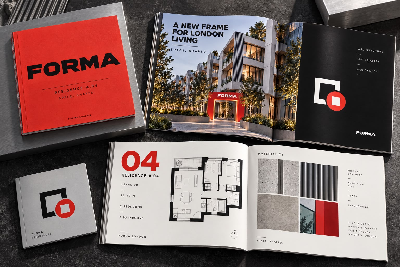
- Development brochureA bold editorial brochure combining architectural photography, floor plans, material details and the distinctive scarlet identity.
- Floor-plan templateA precise, sales-ready drawing system with technical plans, apartment data, scarlet navigation and clear architectural hierarchy.
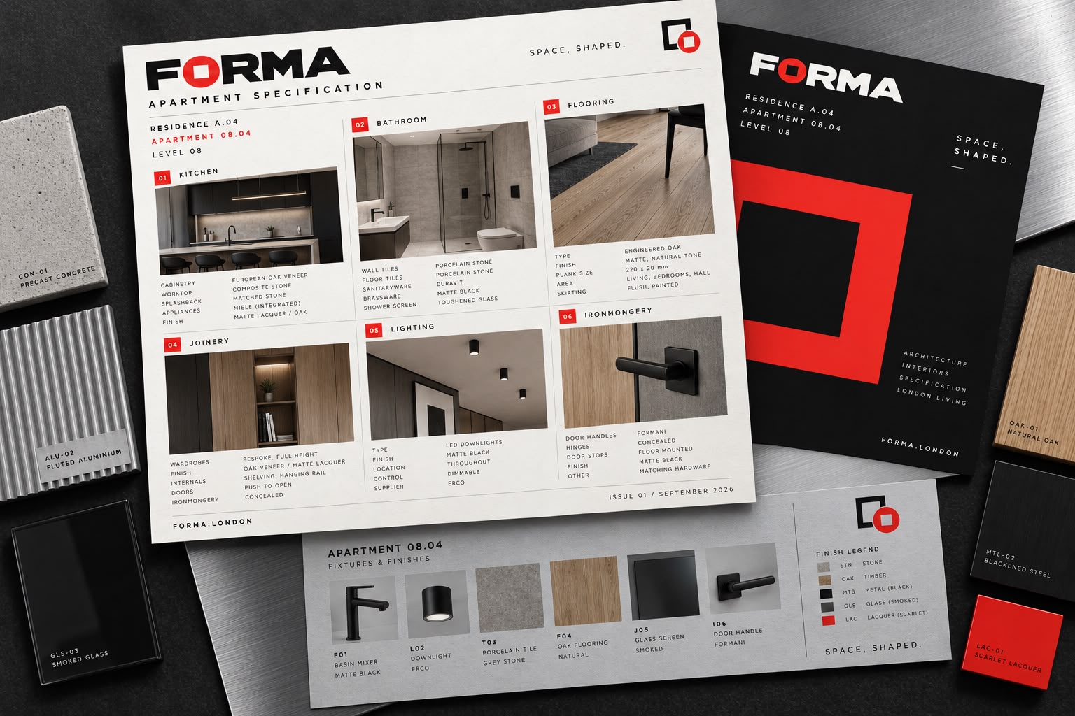
- Apartment specification sheetA clear material and fixtures system combining technical details, interior photography, authentic samples and scarlet navigation.
- Property price listA clear availability schedule with apartment pricing, reservation status, building elevation and key sales information.
- Branded document bagA structured black-and-scarlet carrier with strong portal graphics, aluminium identification tag and coordinated property documents.
- Construction-site hoardingBold street-level branding with giant typography, architectural graphics, integrated signage and strong scarlet visibility.
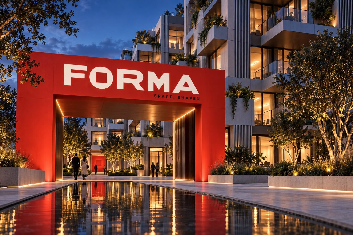
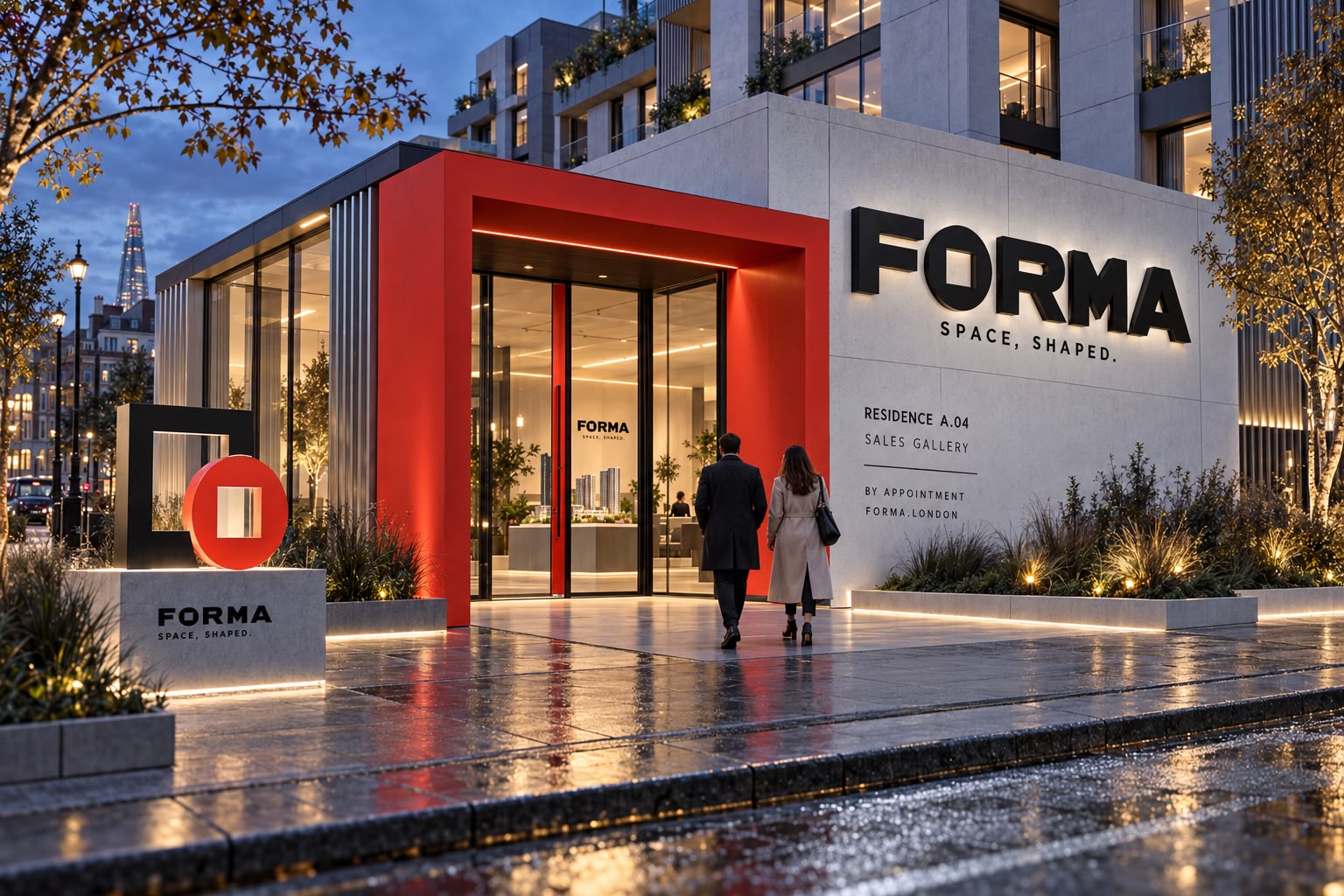
- Sales-suite exteriorA striking scarlet entrance portal, illuminated black signage and sculptural identity marker create a premium, believable arrival experience.
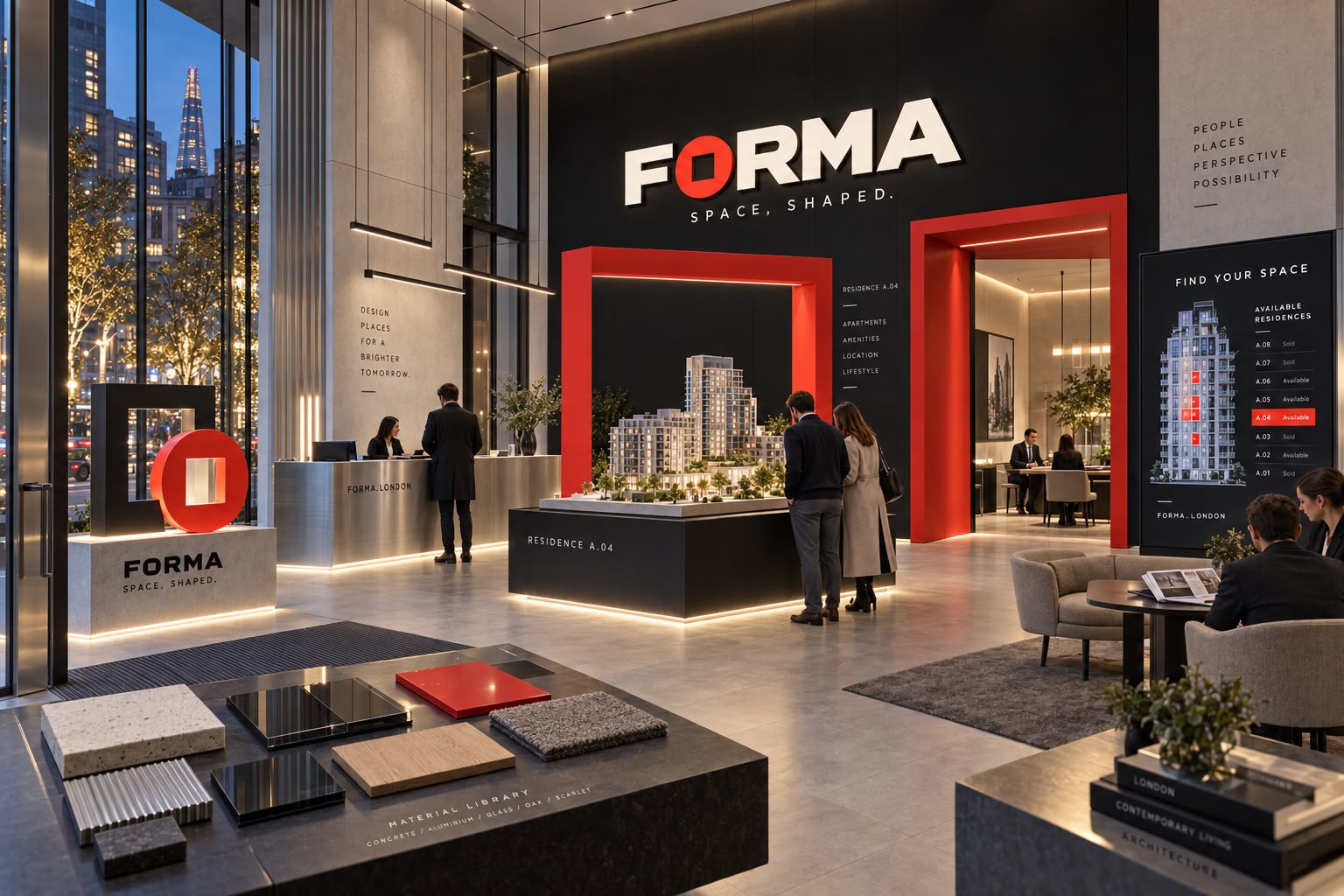
- Sales-suite interiorAn immersive sales gallery with scarlet architectural portals, a detailed development model, material library and digital apartment finder.
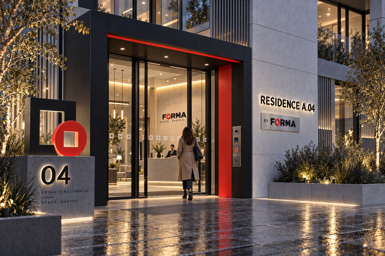
- Building entrance signagePermanent black metal lettering, a controlled scarlet entrance reveal and sculptural address marker create a refined residential arrival.
- Interior wayfindingAn accessible navigation system with illuminated floor numbers, aluminium directories, projecting signs and controlled scarlet routes.
- Website homepage (desktop)A bold, image-led sales website with architectural framing, live availability, floor plans, location data and strong enquiry routes.
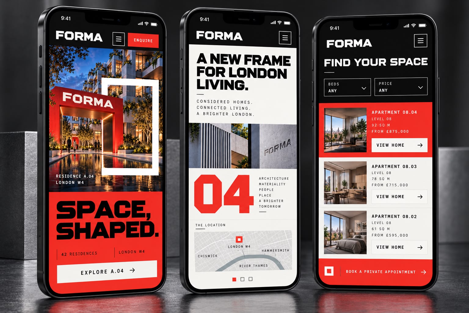
- Website homepage (mobile)A strong responsive journey covering the hero, architectural story, location, apartment search and private appointment booking.
- Apartment-finder pageAn interactive building elevation with live availability, precise filters, apartment plans, comparison tools and direct booking actions.
- Sales prospectus
- Private launch invitation
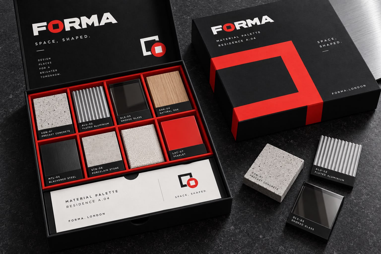
- Material sample box
- Development exterior signage
- Graphic language and patterns
Brand system
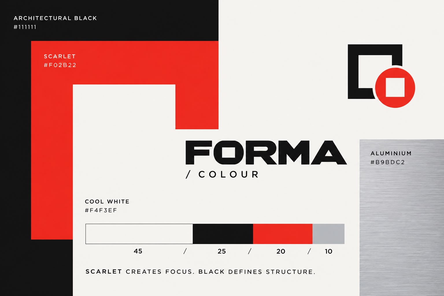
- Scarlet #F02B22
- Architectural Black #111111
- Cool White #F4F3EF
- Aluminium #B9BDC2
- Typography
- Bold geometric display typography, a clean editorial sans serif and precise monospaced property data.
- Photography direction
- Architectural geometry, real residents, sculptural light, material detail and controlled scarlet focal points.
- Symbol
- An abstract square frame and intersecting circle, unified by the central square void , representing space shaped within form.
The work










Result
The identity does its arguing before anyone reaches the sales suite. The scarlet and the square void are legible on a hoarding at speed and still hold at the scale of a floor-plan footnote, and the same system carries through the brochure, the price list, the signage and the apartment finder. A buyer now meets one scheme, told the same way, at every stage of the process.