Fresh out.
BUTTER
Problem
A bakery lives or dies on the walk past. BUTTER had the product and it had the site, but nothing on the street that stopped anyone, and packaging that stopped working the moment it left the shop. In a market where every independent bakery reaches for the same muted, hand-lettered look, it needed to be the one you could pick out from the other side of the road.
Strategy
Fresh out. The brand is loud on purpose , butter yellow as the ground, cobalt blue for the wordmark and cherry red for the dot that signs everything off. Oversized condensed display type does the shouting while a clean supporting sans does the explaining, so a menu board, a butter wrapper and a bus-shelter poster all read from across the street. The pattern system of red circles, cobalt checks and bold stripes flexes from wrapping a single croissant to covering a whole shopfront without ever needing a new asset.
What we built
- Primary logoBold condensed cobalt-blue wordmark, butter-yellow background and a red circular brand symbol.
- WordmarkStandalone cobalt-blue typography without the red symbol, ready for packaging, signage and digital use.
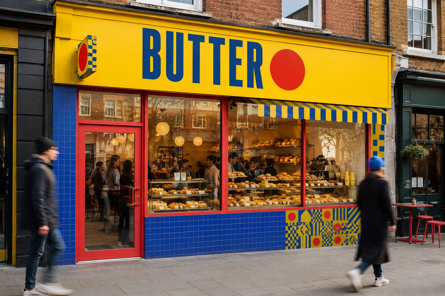
- Bakery shopfrontA London-style storefront featuring branded signage, exterior tiles, awning, graphic pattern and visible bakery interior.
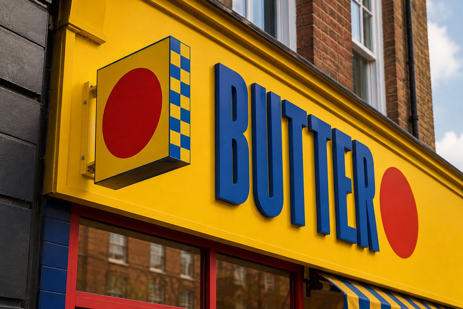
- Exterior signageDimensional cobalt lettering, the yellow fascia and the projecting red-dot sign with checkerboard edges.
- Interior counterBranded bakery interior with cobalt tiling, yellow menu board, graphic details, staff uniforms and pastry displays.
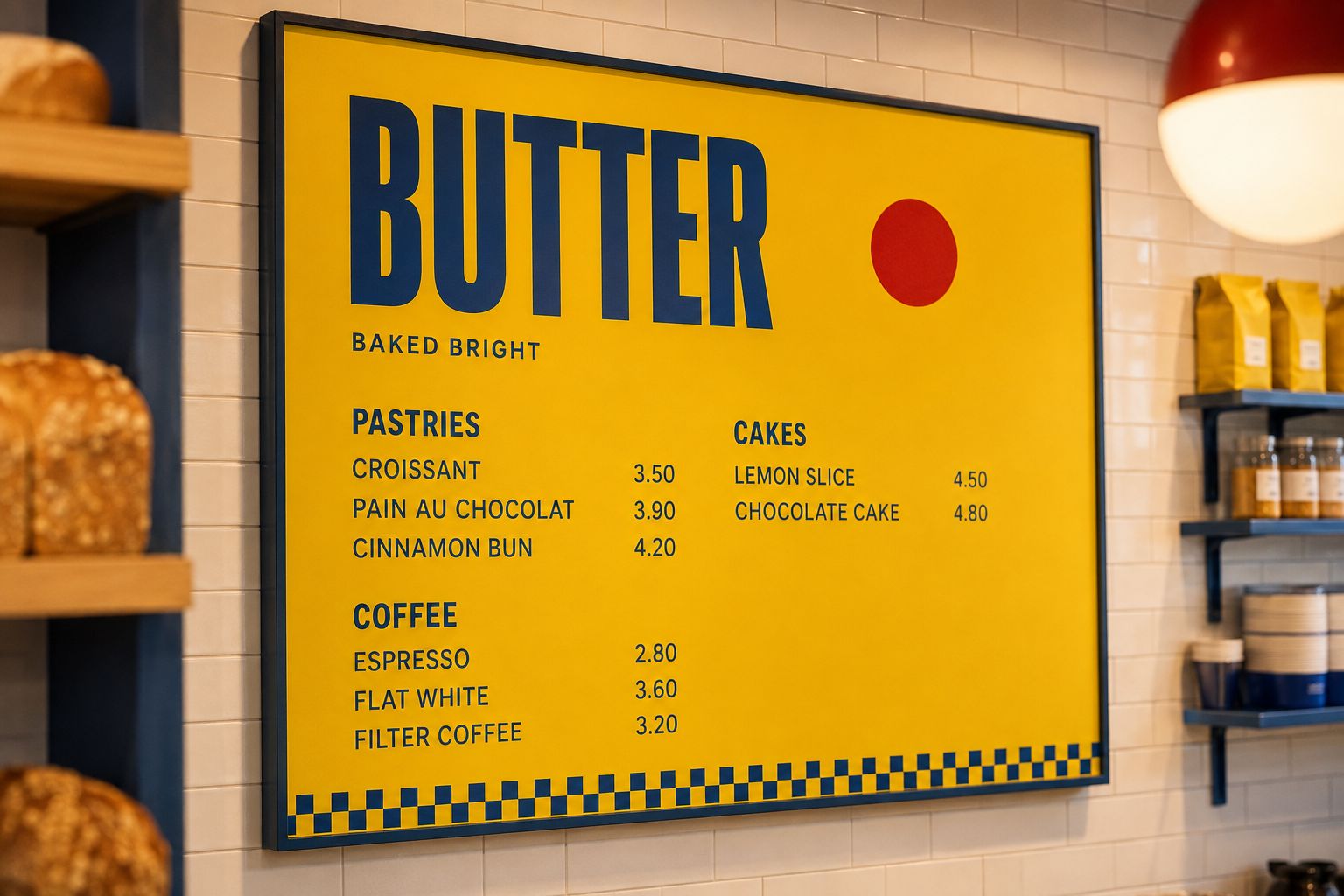
- Menu boardBold yellow in-store menu with clear sections, strong typography, red-dot branding and a cobalt checker detail.
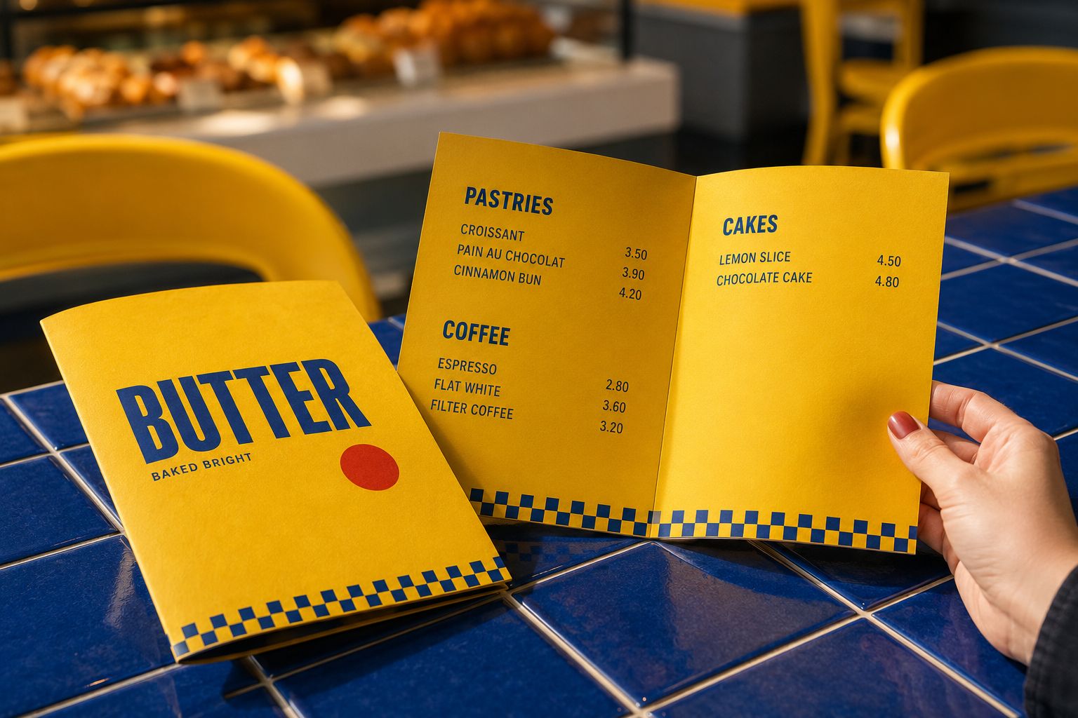
- Printed menuA tactile folded menu featuring the branded cover, clear product categories, bold typography and checkerboard detail.
- Takeaway coffee cupYellow paper cup with vertical cobalt wordmark, blue lid, red-dot symbol and checkerboard base detail.
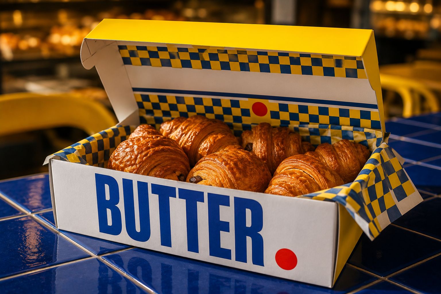
- Pastry boxOpen branded box with bold exterior typography, yellow lid, red-dot symbol and checkerboard tissue.
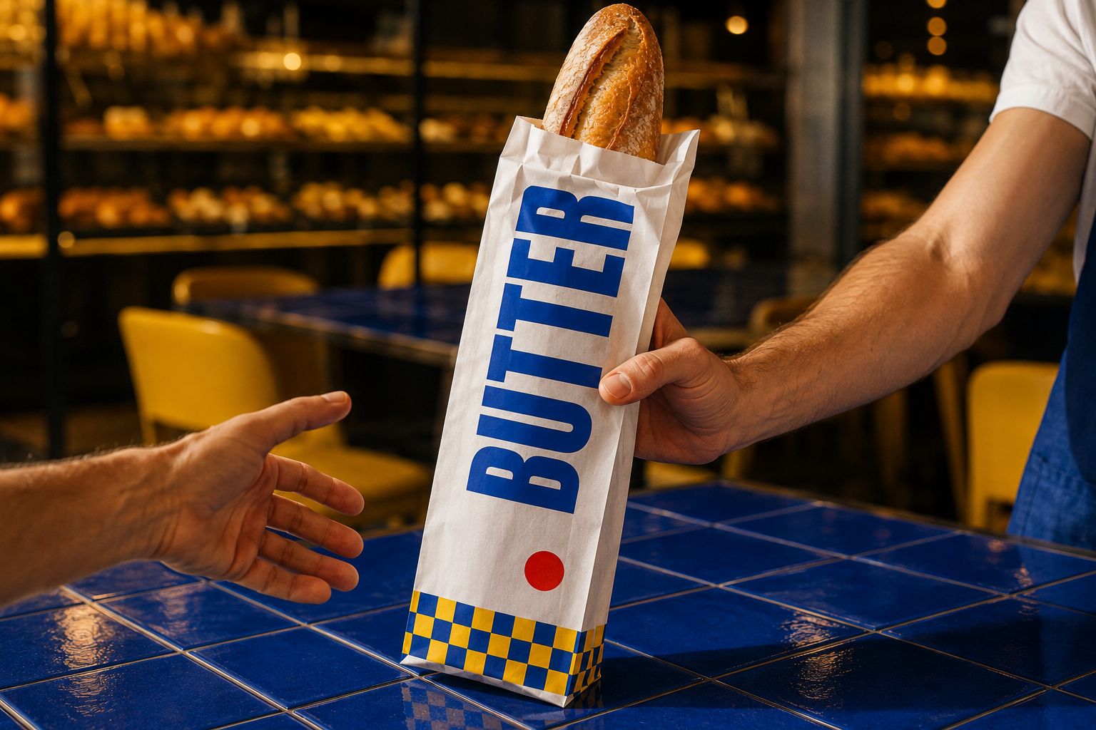
- Bread bagWhite paper baguette bag with an oversized vertical wordmark, red-dot symbol and blue-yellow checkerboard base.
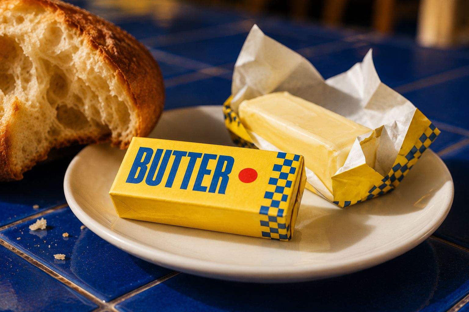
- Butter wrapperSignature yellow butter packaging with cobalt wordmark, red-dot symbol and checkerboard edge, shown wrapped and opened.
- Sandwich packagingRecyclable yellow paperboard sleeve with cobalt wordmark, red-dot symbol and checkerboard edge.
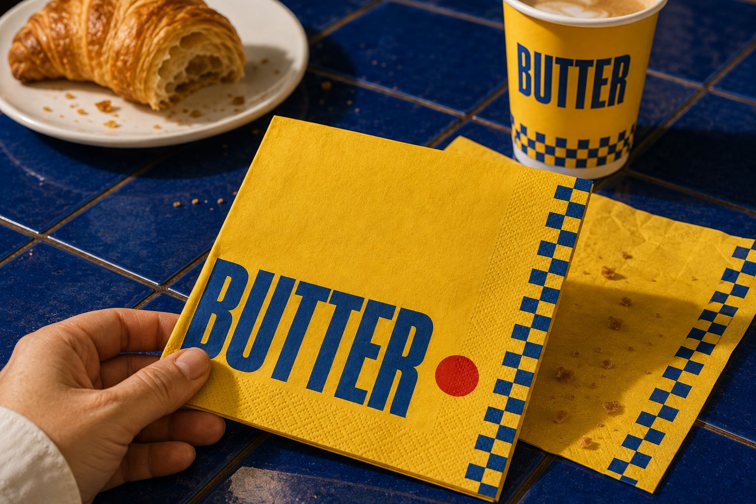
- Branded napkinYellow recycled-paper napkin with oversized cobalt wordmark, red-dot symbol and checkerboard border.
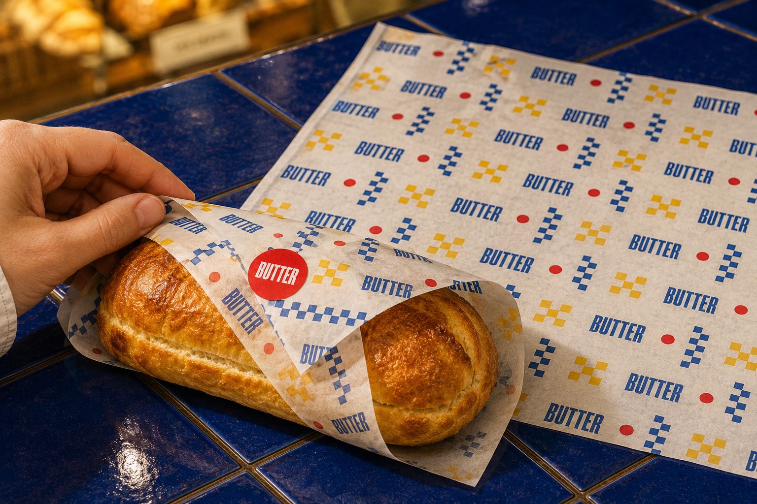
- Food wrapping paperCustom greaseproof paper with a repeating wordmark, red-dot and geometric checker pattern.
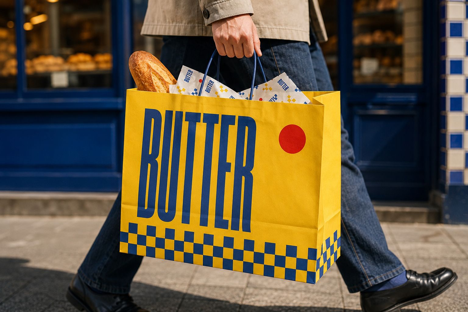
- Paper takeaway bagLarge yellow paper bag with oversized cobalt wordmark, red-dot symbol, checkerboard base and branded wrapping paper inside.
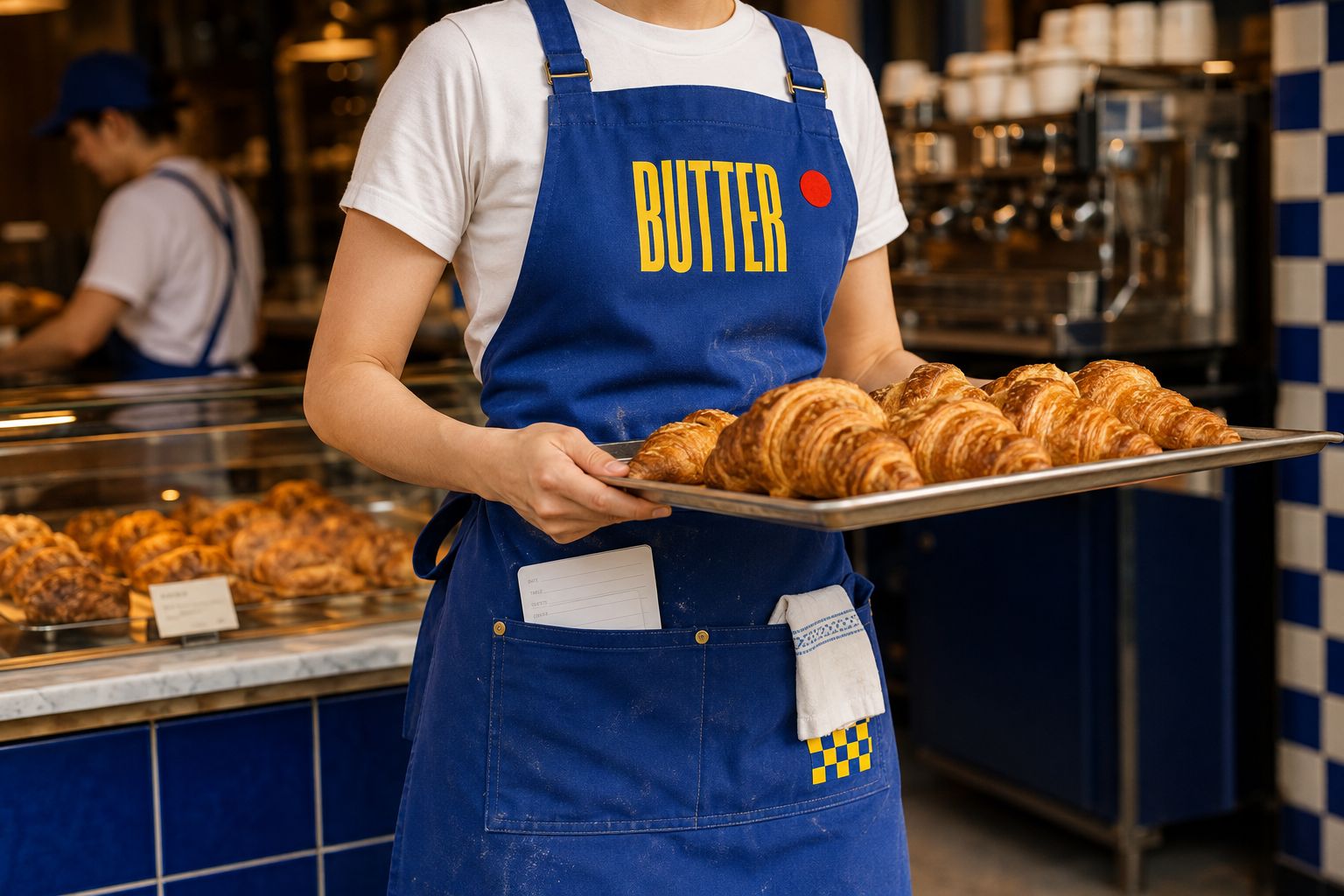
- Staff apronCobalt canvas apron with yellow wordmark, red-dot badge, checker-pattern pocket and practical bakery-service details.
- Staff T-shirtWhite front uniform with a small chest logo, plus a yellow back version with oversized typography and checker detail.
- Loyalty cardDouble-sided stamp card with bold yellow branding, reward circles and the message “Buy 8. Get 1 Free.”
- Business cardBold yellow branded front with a clean white reverse containing the manager’s contact details.
- Social media postA “FRESH OUT” campaign featuring oversized typography, a close-up croissant, red circle and minimal opening-time message.
- Website homepageBold desktop website featuring the “FRESH OUT” hero, online-order CTA, product favourites, brand story and bakery locations.
- Mobile websiteResponsive mobile experience showing the hero, product ordering, brand story and bakery locations across three screens.
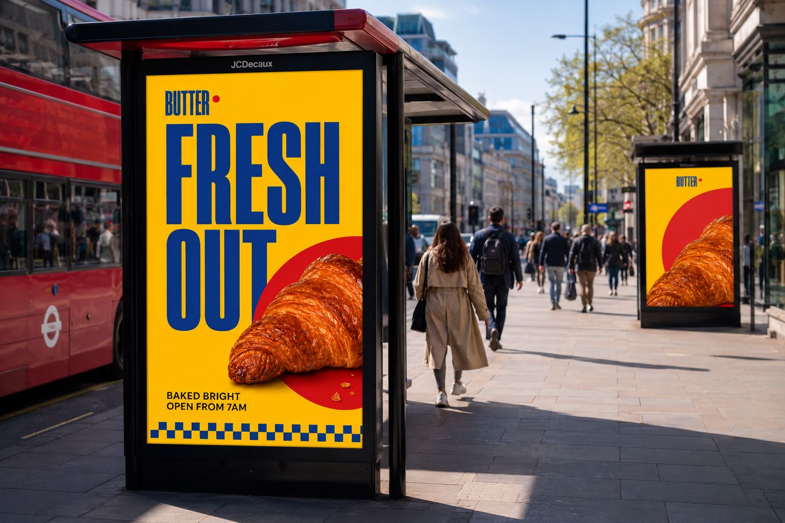
- Outdoor advertisementA London bus-shelter campaign featuring the “FRESH OUT” headline, close-up croissant, red circle and strong morning-opening message.
- Graphic pattern
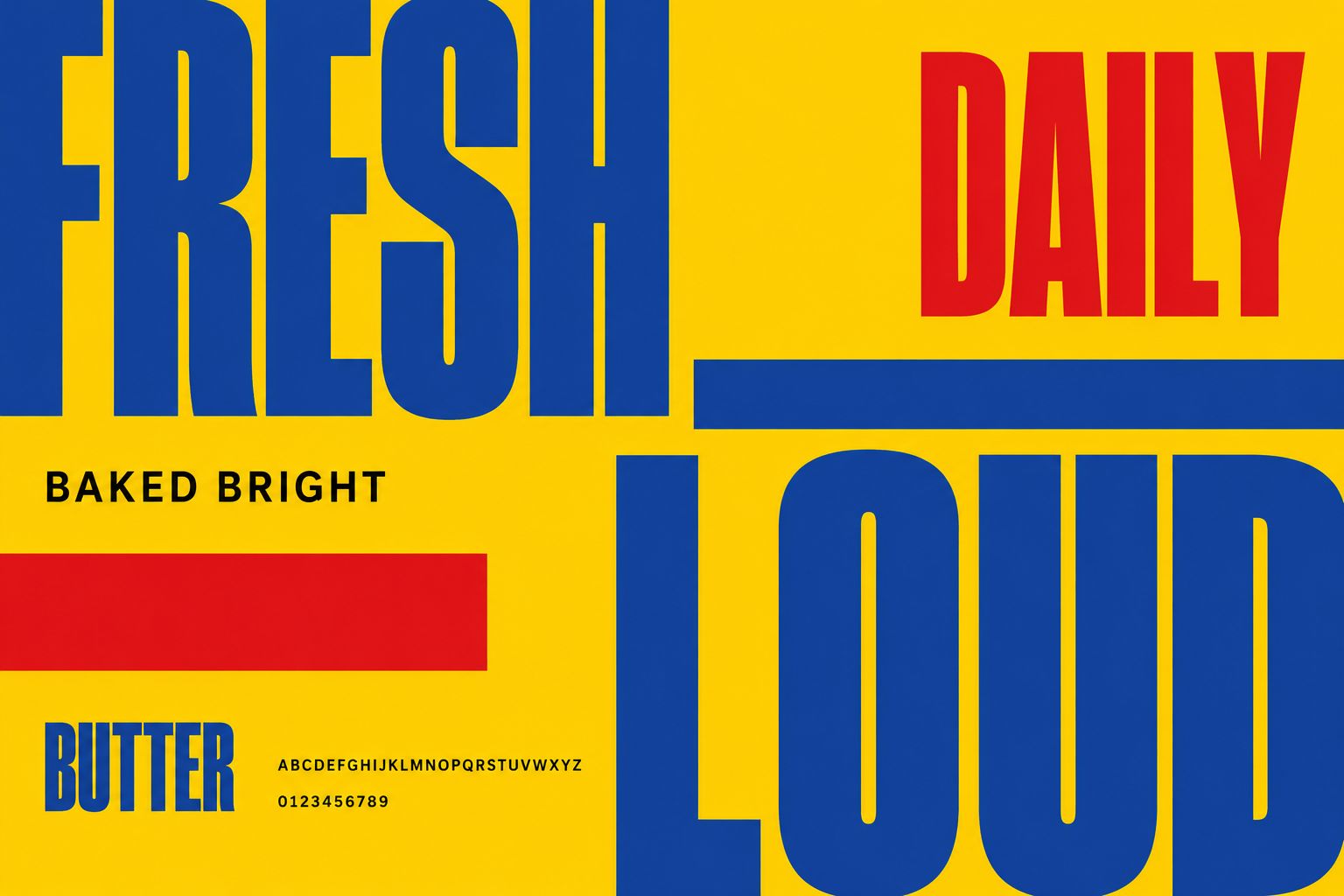
- Typography layout
- Full product collection image
Brand system
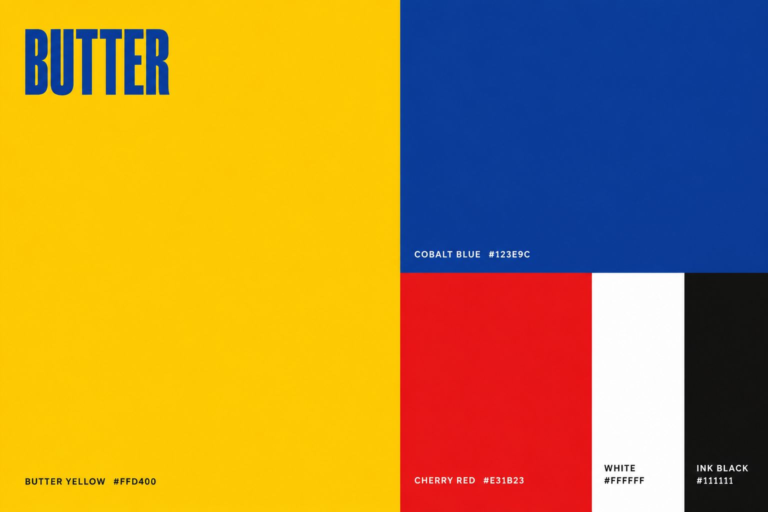
- Butter Yellow #FFD400
- Cobalt Blue #123E9C
- Cherry Red #E31B23
- White #FFFFFF
- Ink Black #111111
- Typography
- Oversized condensed display typography paired with a clean supporting sans serif for menus, packaging, campaigns and digital content.
- Graphic language
- A flexible system combining red circles, cobalt checks and bold stripes on the signature yellow background.
The work






Result
The brand works at the distance it needs to. Butter yellow and cobalt make the shopfront legible from the other side of the road, and the same system runs through the menu board, the packaging and the bus shelter, so a bread bag or a coffee cup carries the brand well past the counter. Every piece a customer handles is doing the advertising.