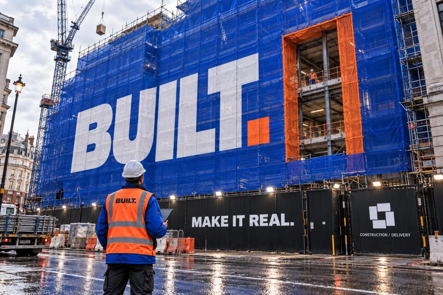
MAKE IT REAL.
BUILT.
Problem
Construction is judged on trust well before it is judged on price, and most firms look interchangeable on a tender document. BUILT. was winning work through relationships and losing it on first impressions, with a brand that read like a subcontractor's when it sat alongside firms twice its size. Everything from the van to the tender pack needed to say the same thing about the standard of the work.
Strategy
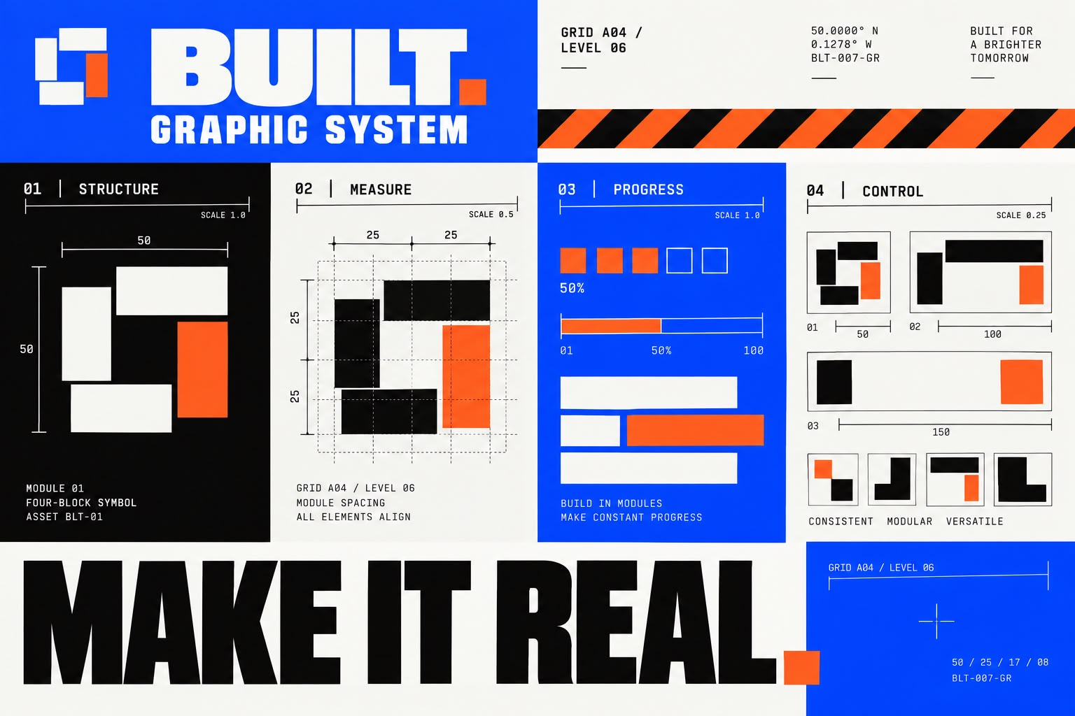
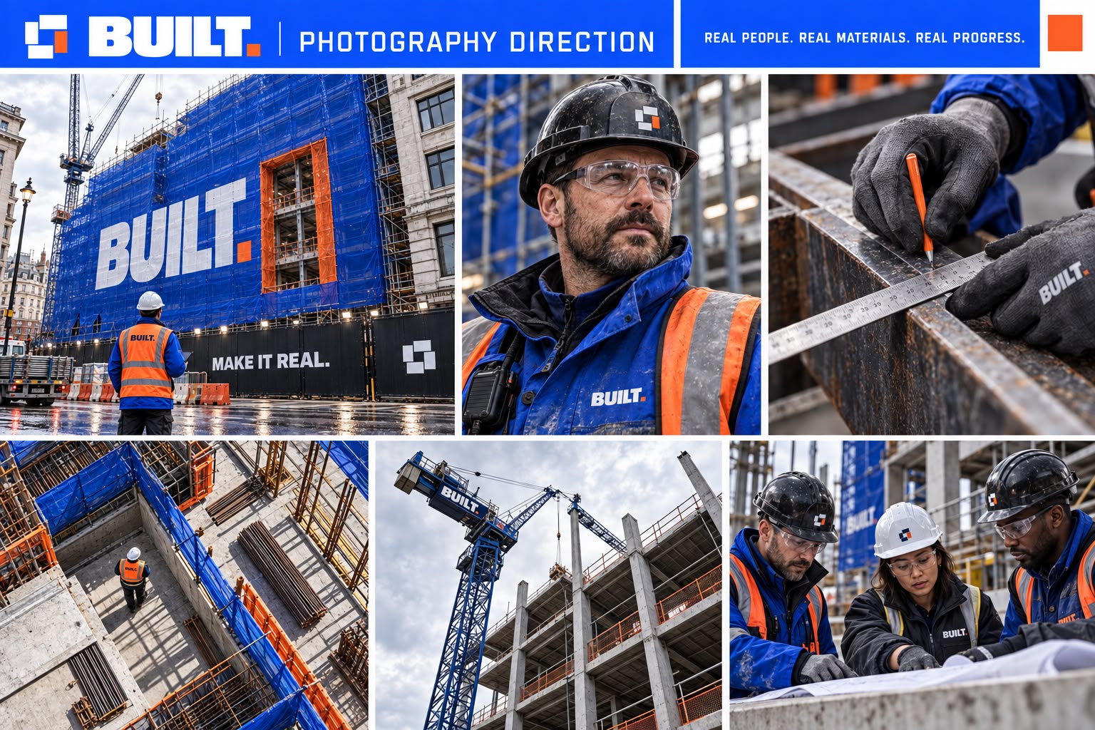
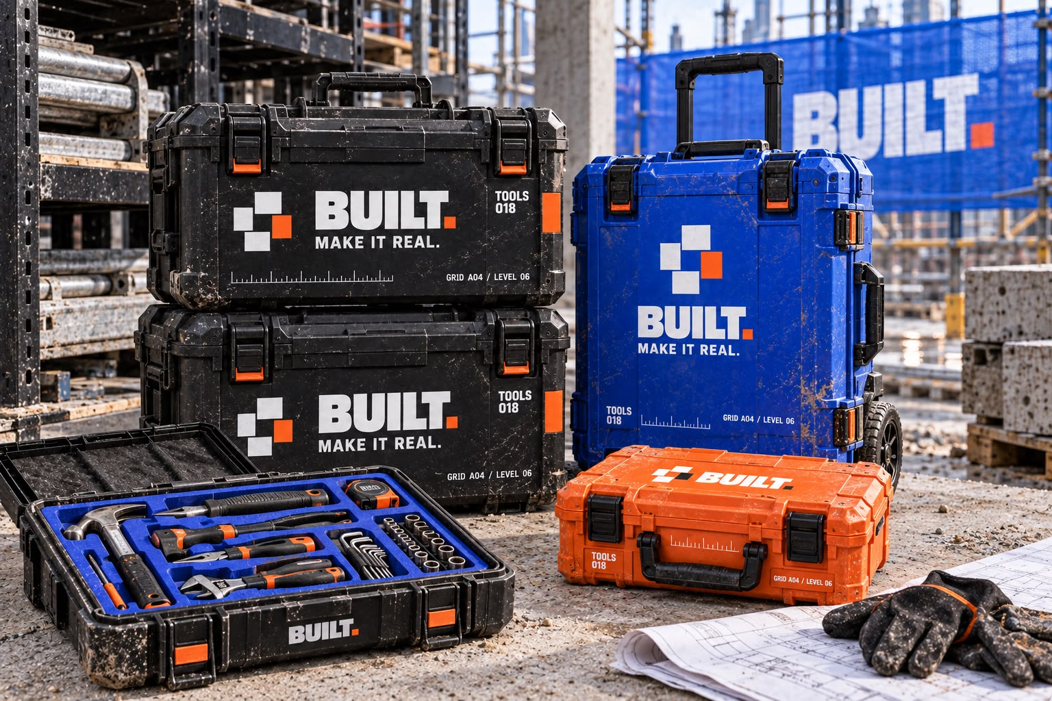
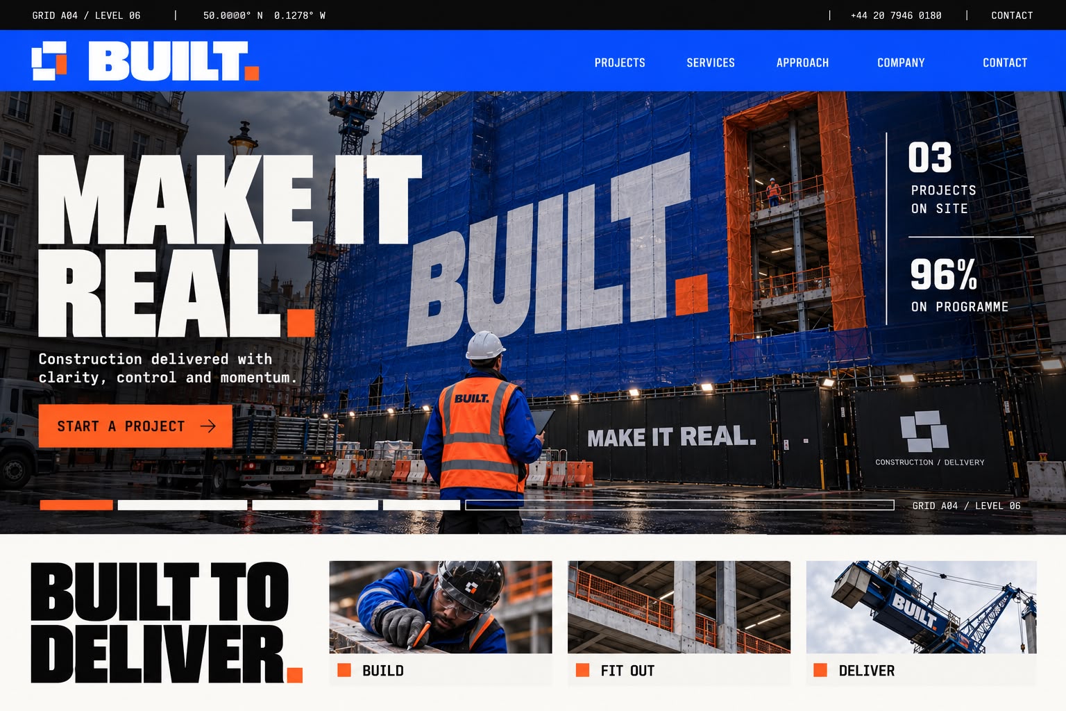
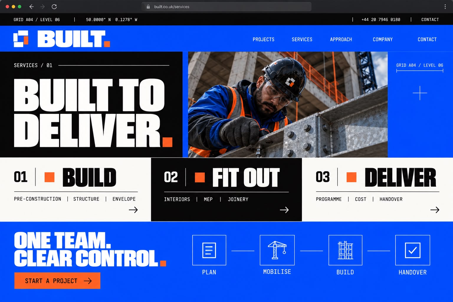
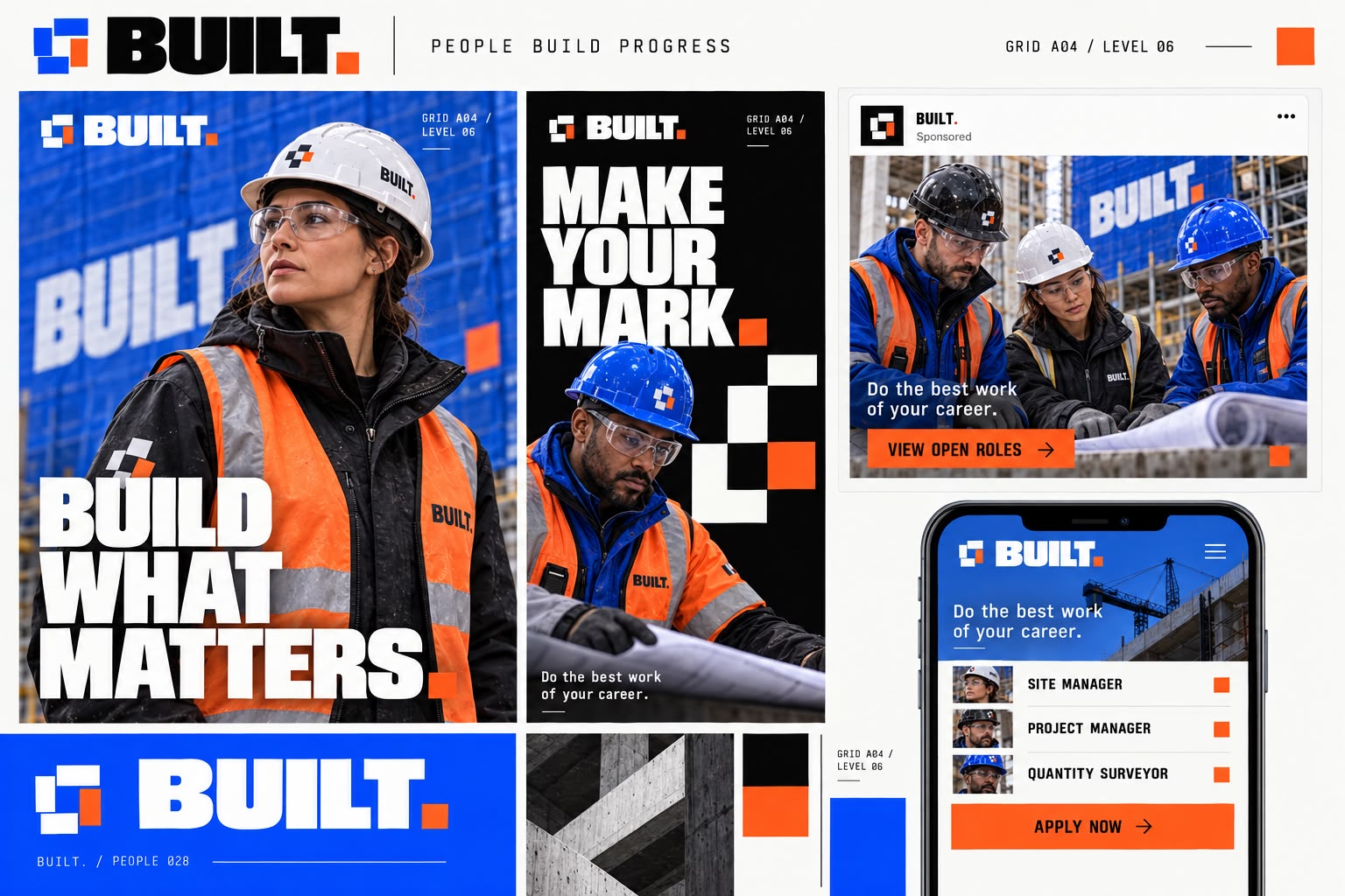
Make it real. The position is deliberately unapologetic , bold, industrial, precise , and the symbol carries it: four structural blocks locking around a central opening, with one orange component marking progress and action. The system is modular by design, built from structural blocks, measurement grids, safety stripes, technical coordinates and orange progress markers, so it survives a hard hat, a tender document and a building wrap in the same week. Photography stays on authentic London sites with skilled teams and real materials, cobalt and orange used as controlled accents rather than decoration.
What we built
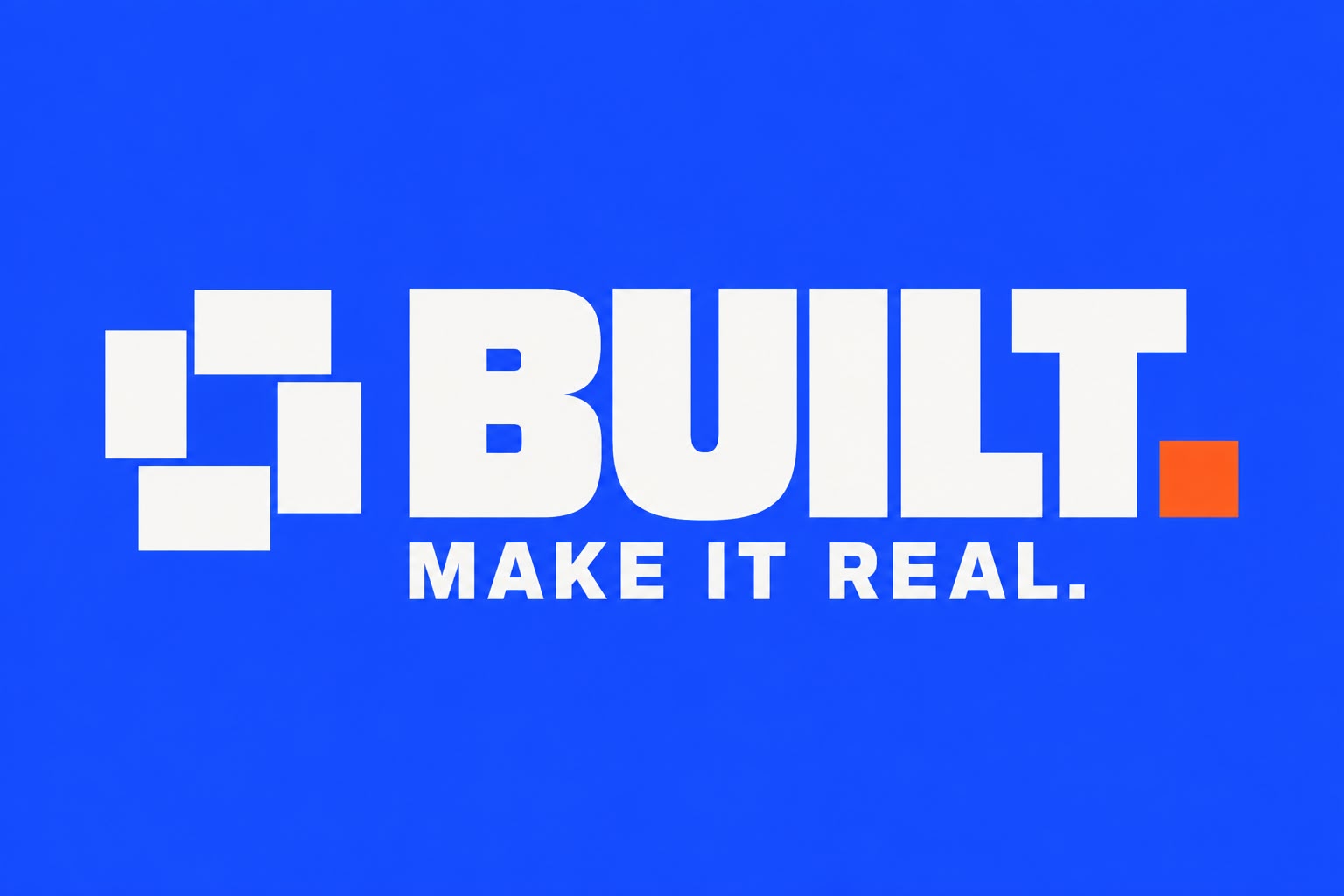
- Primary logoA bold engineered lock-up combining the structural block symbol, heavyweight wordmark and safety-orange full stop.
- Standalone wordmarkA heavyweight black wordmark with the structural safety-orange full stop and cobalt construction line.
- Construction symbolFour structural blocks lock around a central opening, with one orange component marking progress and action.
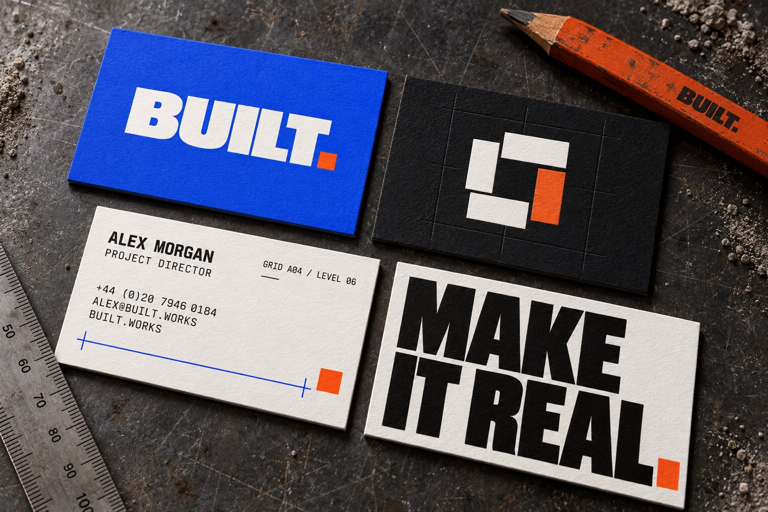
- Business cardsHeavy textured card stock, strong industrial typography, modular symbol and precise technical detailing.
- LetterheadA precise, practical stationery system using architectural grids, measurement lines and strong cobalt branding.
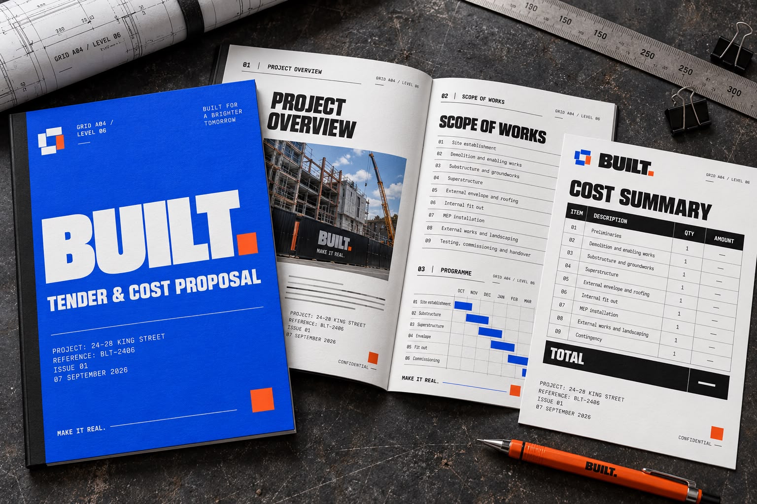
- Quotation and tender documentA professional tender pack with clear scope, programme and cost-summary sections, designed for fast on-site and client use.
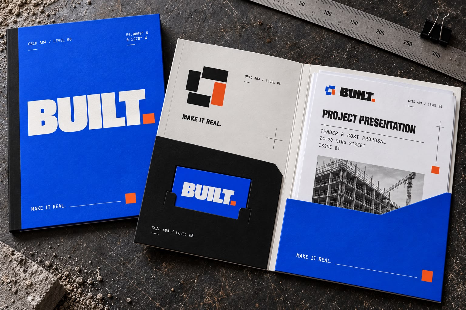
- Presentation folderA durable cobalt folder with engineered pockets, coordinated tender documents and the modular construction symbol.
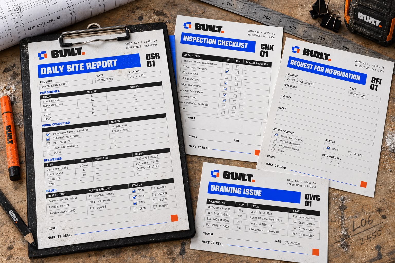
- Site-document templateClear, durable forms for daily reports, inspections, information requests and drawing issues.
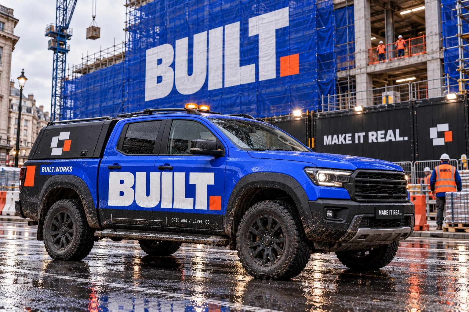
- Construction vehicleA rugged cobalt site truck with bold fleet branding, technical markings and practical orange safety accents.
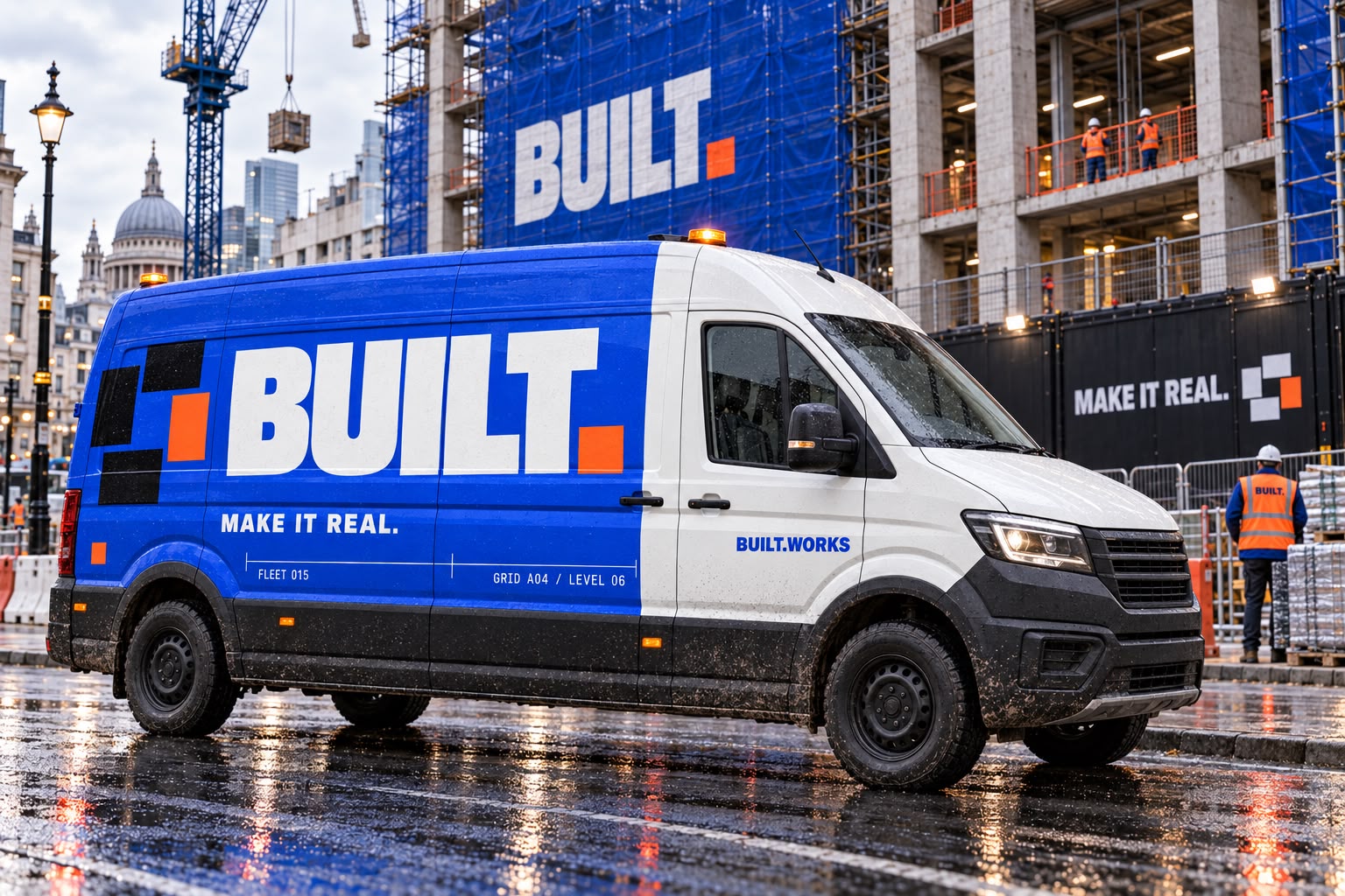
- Delivery vanA high-impact urban fleet design with oversized branding, structural block graphics and practical technical markings.
- Hard hatsA coordinated PPE range with clear role identification, durable branding and realistic site wear.
- High-visibility workwear
- Branded tool cases
- Site hoarding
- Temporary site fencing
- Building signage
- Safety and information signs
- Site-office container
- Website homepage (desktop)
- Website homepage (mobile)
- Services page
- Project case-study page
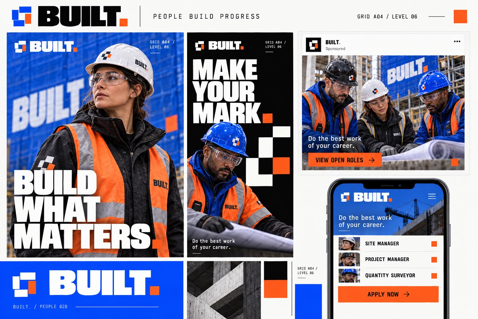
- LinkedIn and recruitment campaign
Brand system
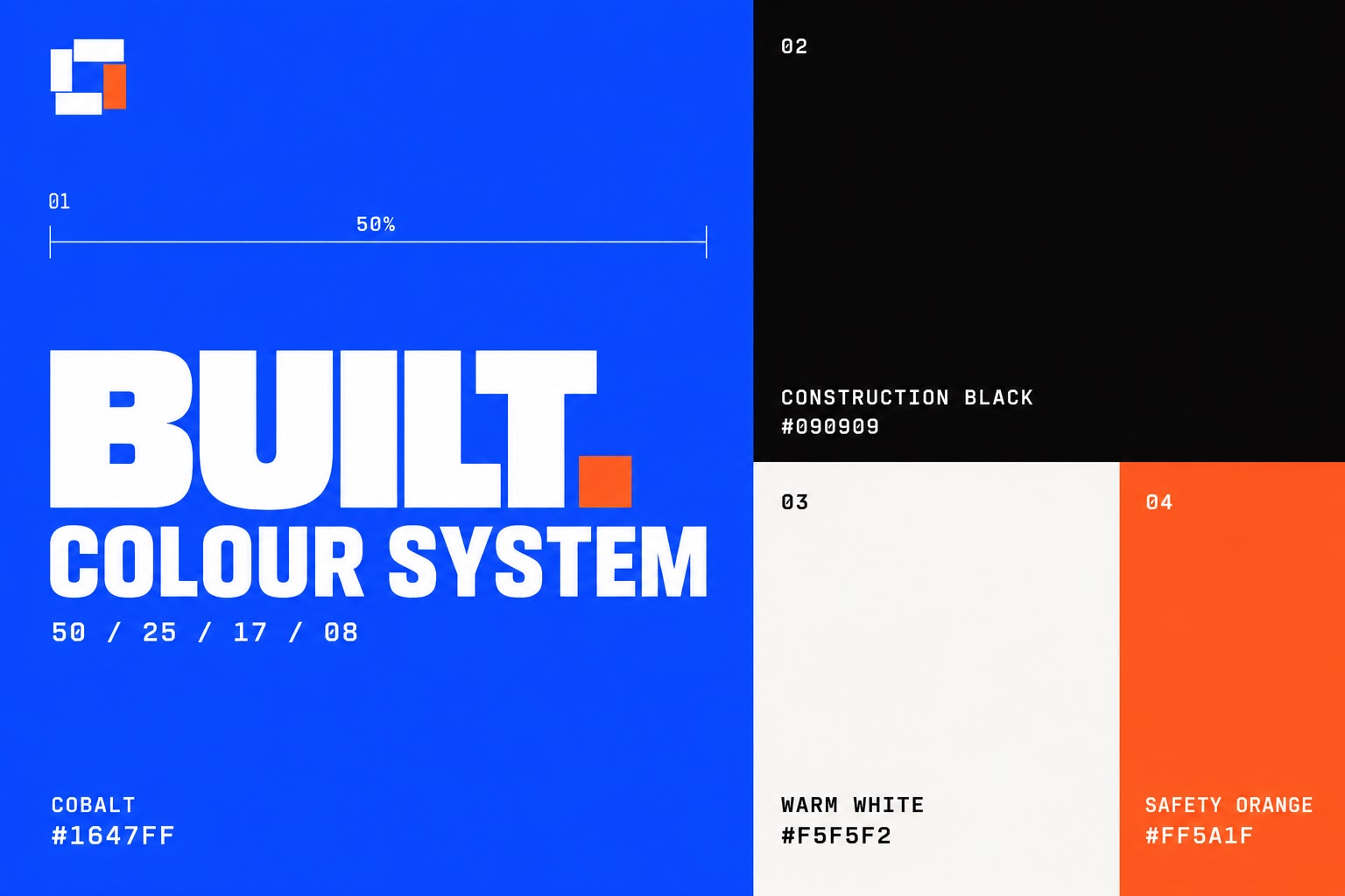
- Cobalt #1647FF
- Safety Orange #FF5A1F
- Construction Black #090909
- Warm White #F5F5F2
- Typography
- Heavy industrial grotesk for brand headlines, condensed sans for information and signage, and monospaced type for technical data and project references.
- Graphic language
- A strong modular system using structural blocks, measurement grids, safety stripes, technical coordinates, and orange progress markers.
- Photography direction
- Authentic London sites, skilled teams, real materials and controlled cobalt-and-orange brand accents.
The work









Result
The brand reads at the standard of the work. MAKE IT REAL sits on the hoarding, the workwear, the vehicle livery and the tender document without softening anywhere, and the cobalt and safety orange make the firm identifiable on a site where everything else is high-vis and grey. In a tender, the pack now looks like it came from the company that will actually run the job.