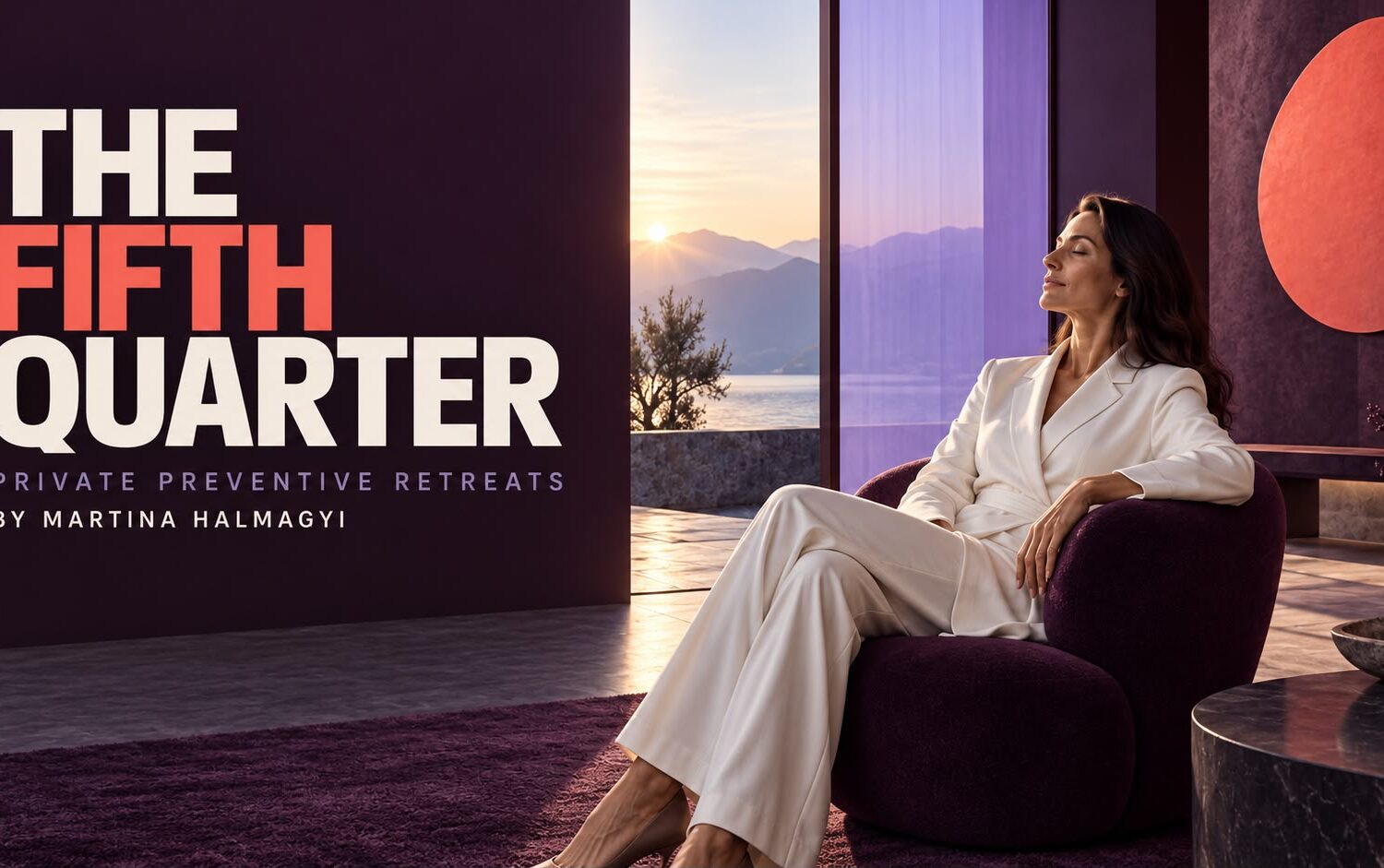
Recovery retreat brand
The Fifth Quarter
Problem
Recovery is a crowded and very loud category, and the people this retreat is built for are the least likely to respond to volume. They want discretion, a sense of clinical seriousness, and no suggestion that their stay is a lifestyle purchase. The retreat needed a brand that could sell a genuinely private experience without speaking so quietly that nobody found it.
Strategy
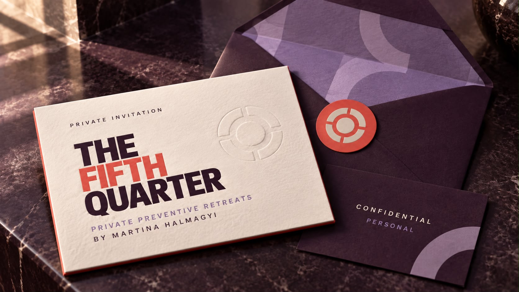
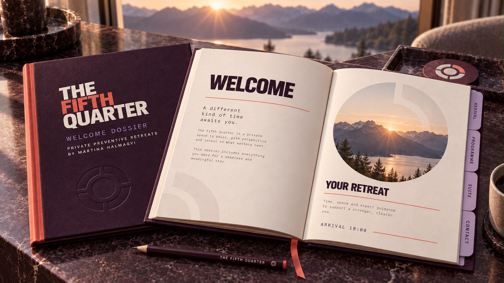
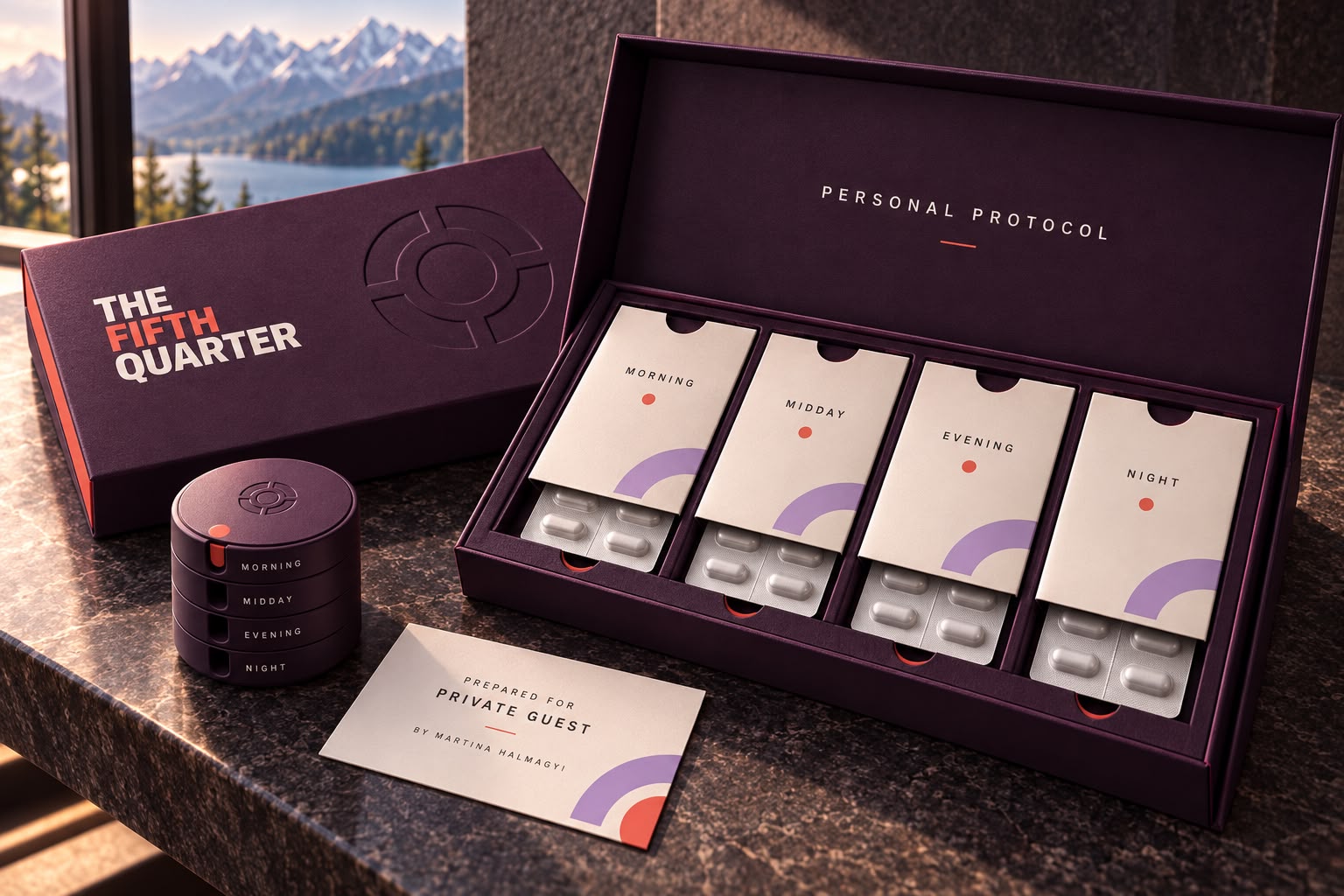
The brand treats rest as a discipline rather than a luxury, and “rest is strategy” is the line the whole system exists to support. The audience is people carrying extraordinary responsibility, who will not respond to conventional wellness language and who need discretion more than they need atmosphere. So the identity behaves like a private clinic that happens to be beautiful. A narrow palette of deep aubergine, ivory and coral, a quartered-circle symbol that stays abstract, and a graphic system with four named states, Protect, Pause, Reset and Return, that gives the brand somewhere to move without raising its voice. The private invitation, the confidential assessment folder, the programme booklet and the member portal all hold the same register, so the tone never changes between the retreat and the phone.
What we built
- Primary logo
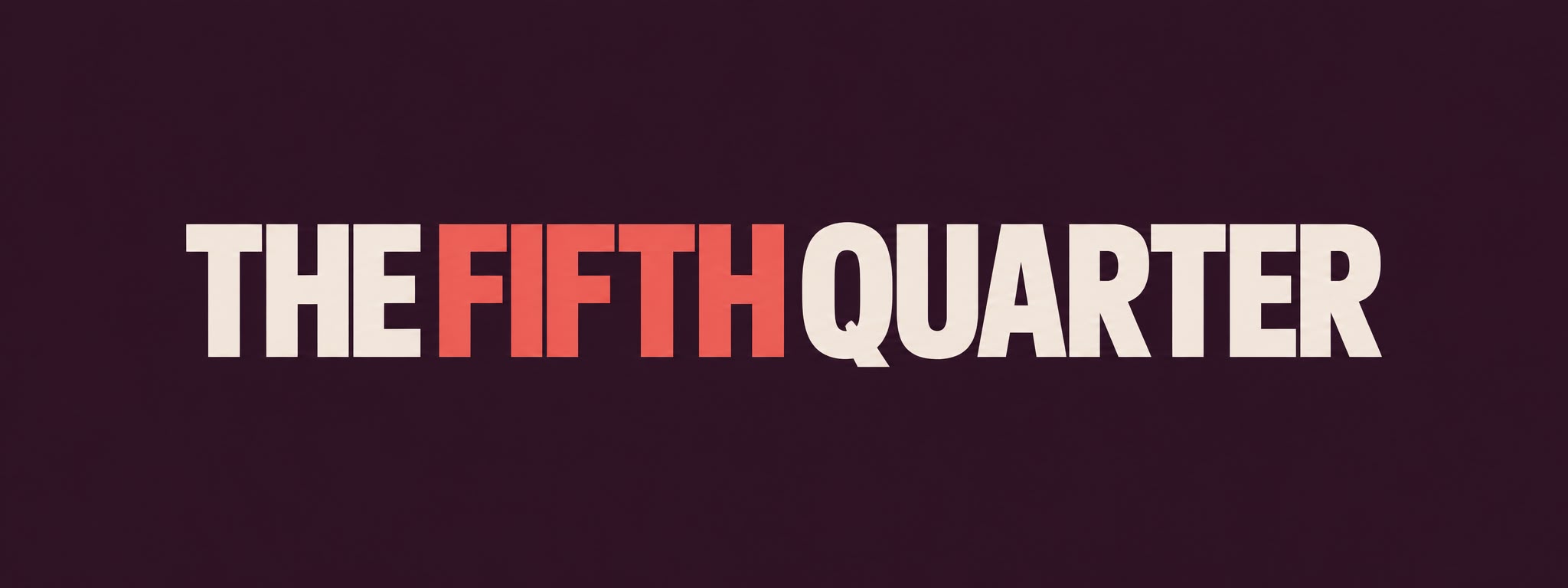
- Standalone wordmark
- Abstract brand symbol
- Colour palette
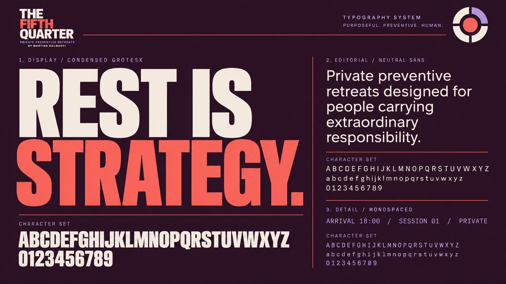
- Typography system
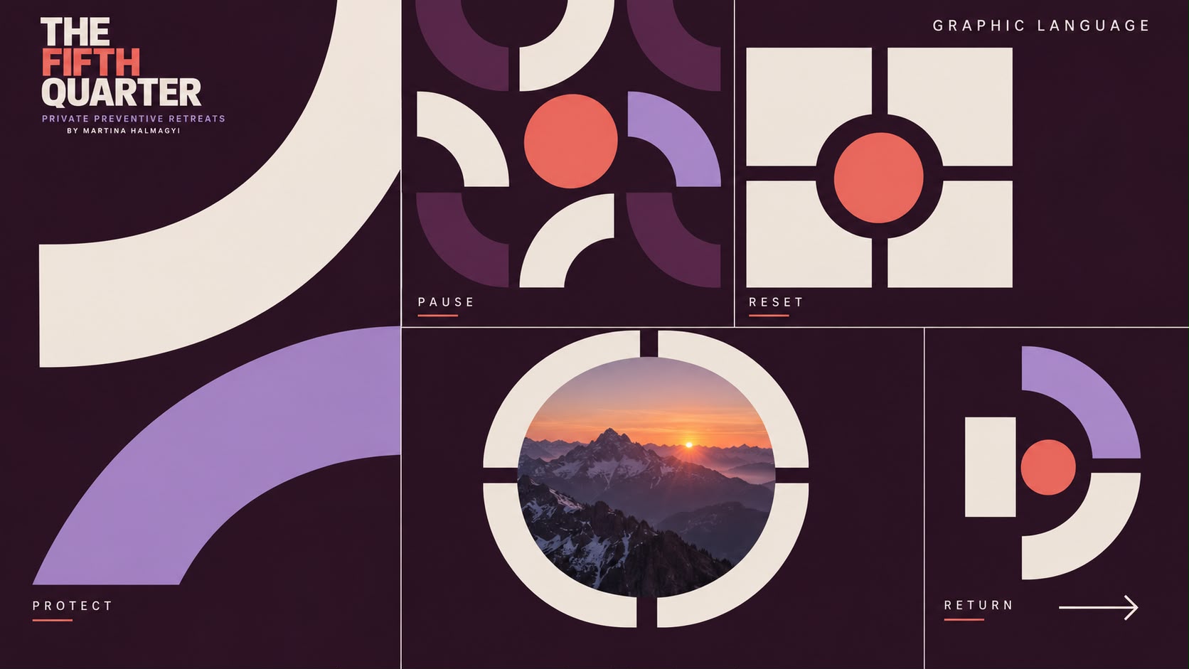
- Graphic language
- Guest stationery
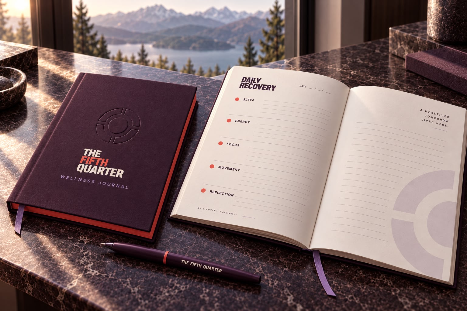
- Wellness journal
- Sleep mask and robe
- Recovery skincare kit
- Supplement packaging
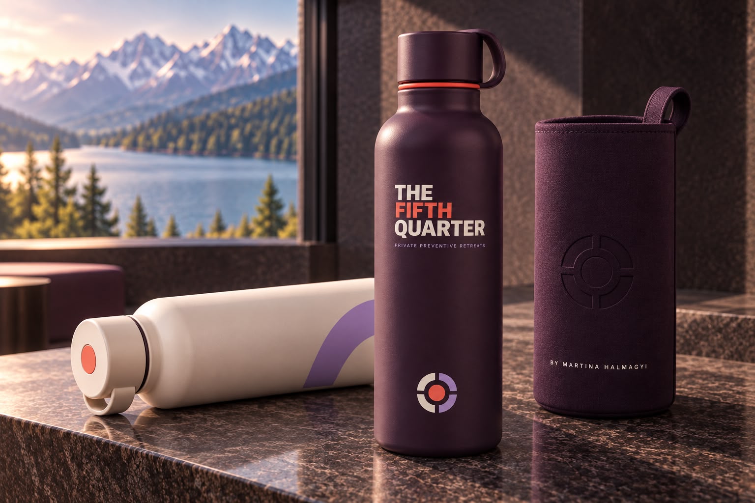
- Water bottle
- Luxury travel bag
- Confidential health assessment folder
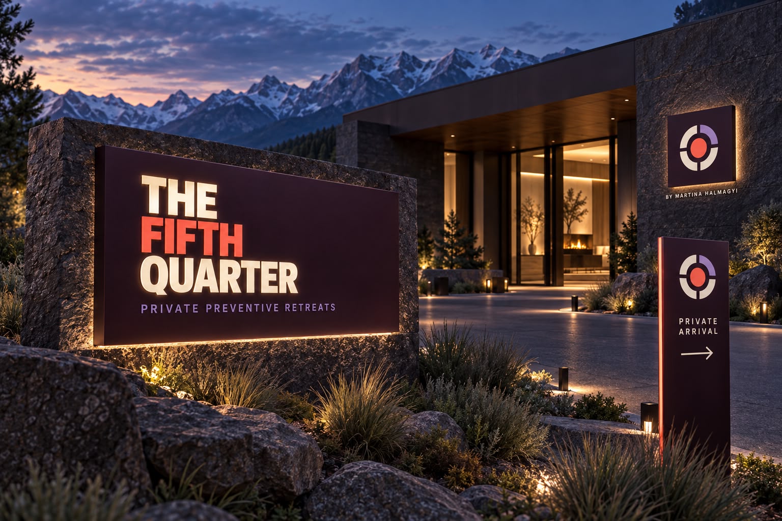
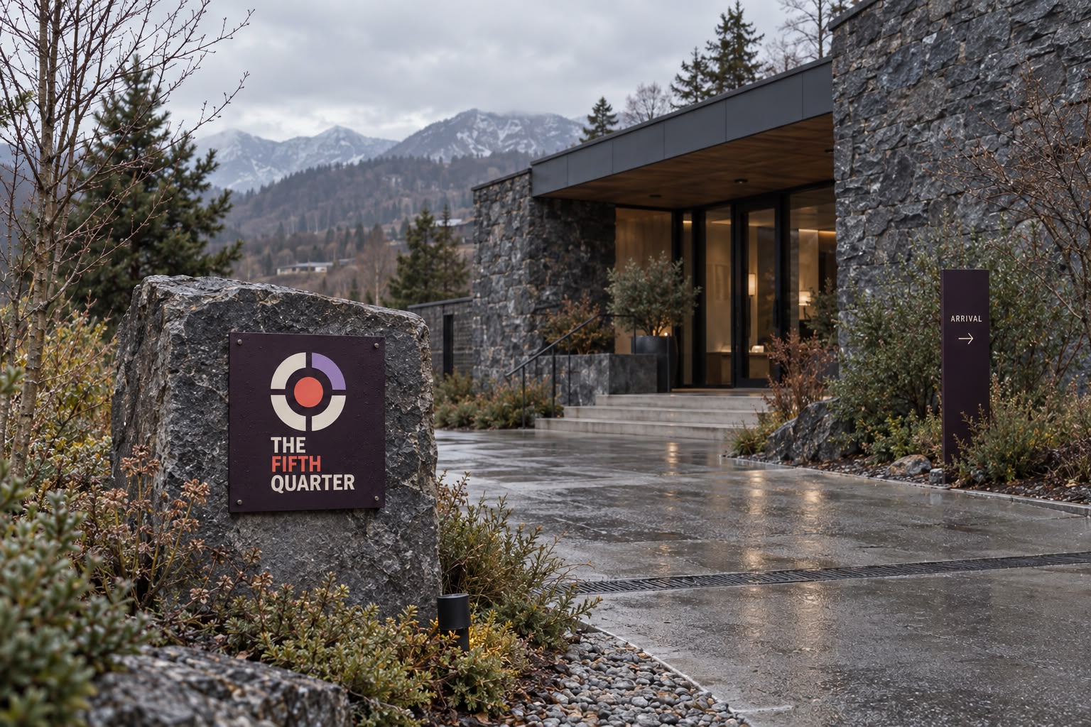
- Retreat exterior signage
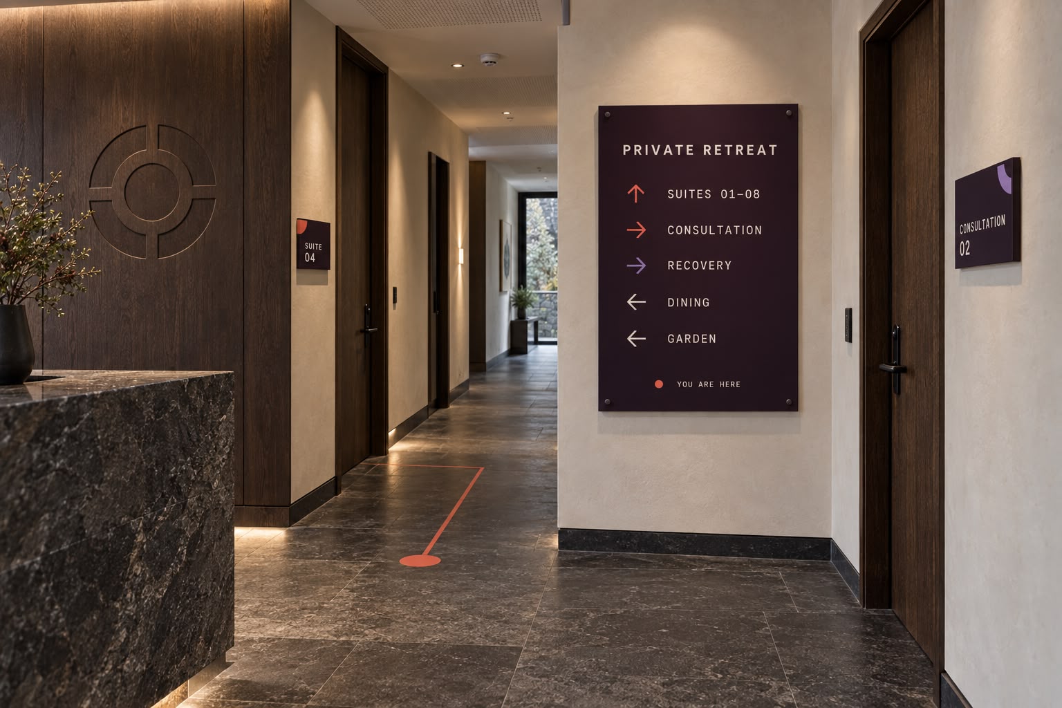
- Interior wayfinding
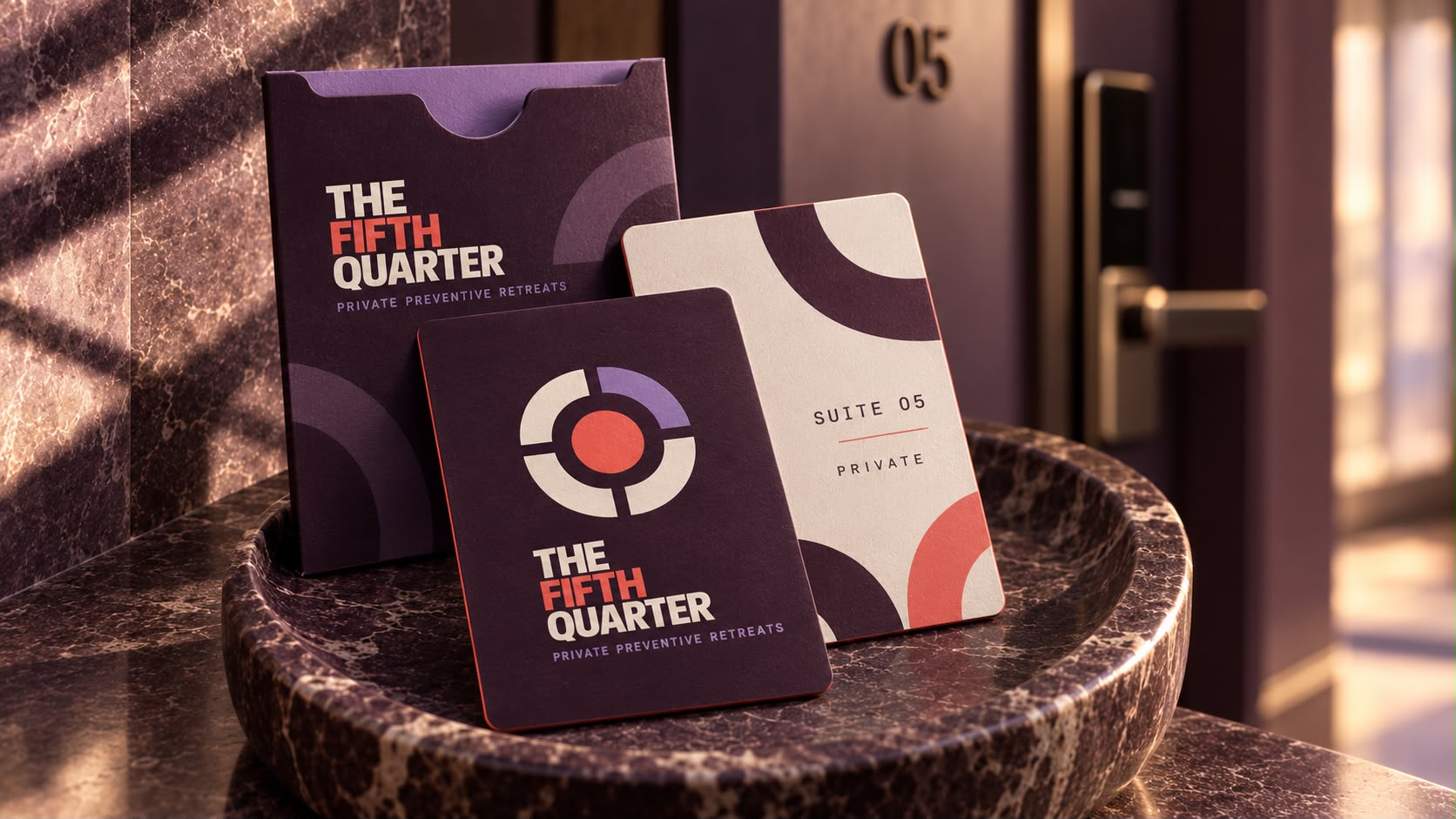
- Branded private suite
- Website homepage (desktop)
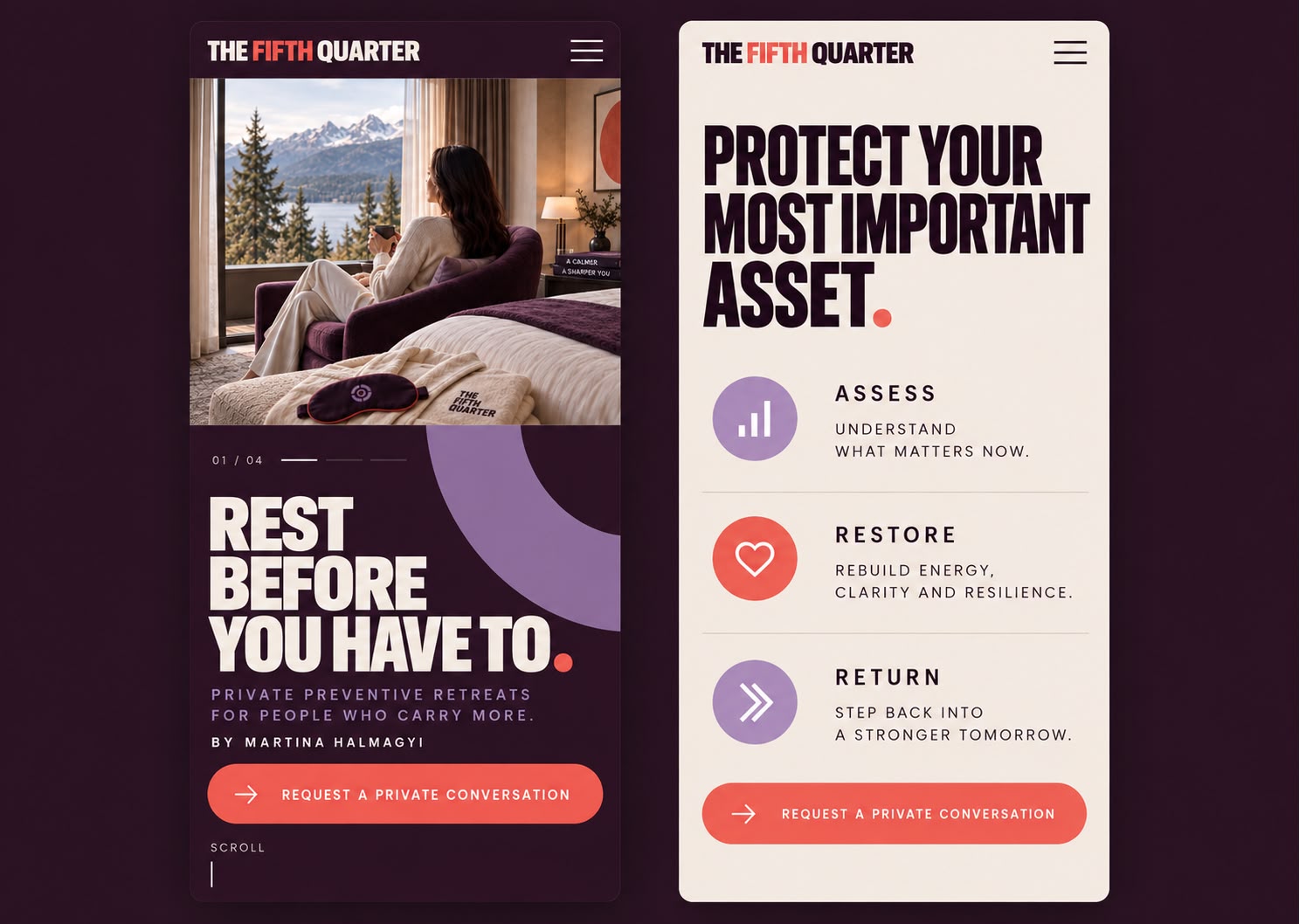
- Website homepage (mobile)
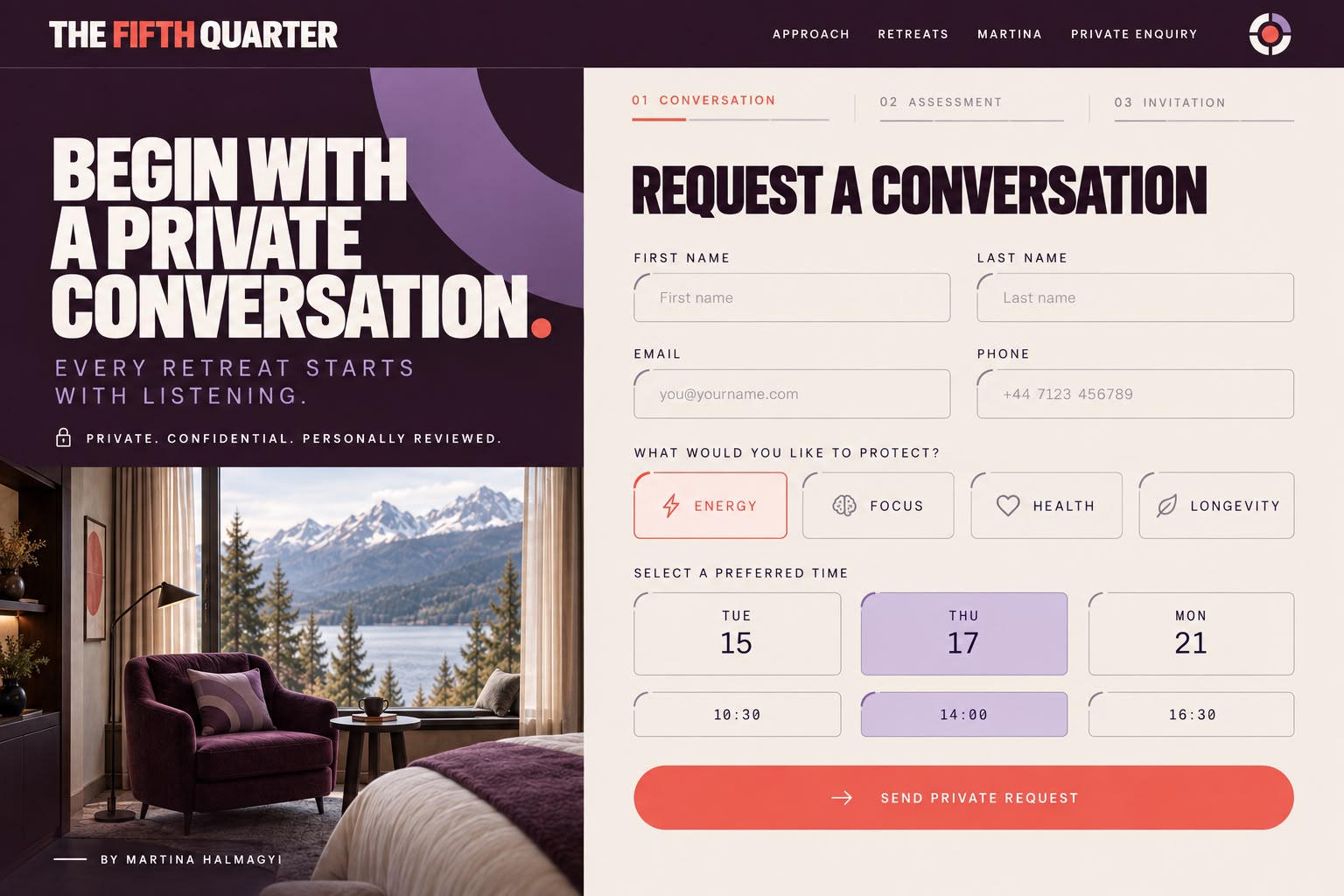
- Private booking page
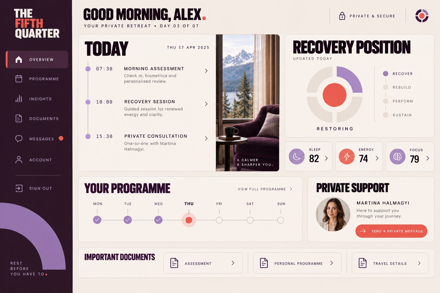
- Member portal
- LinkedIn campaign
Brand system
- Deep Aubergine #291525
- Warm Ivory #EEE5DC
- Coral #E8675B
- Plum #45213E
- Muted Lavender #A486BD
- Typography
- A condensed grotesk for display, a neutral sans for editorial text, and monospaced type for arrival times, session numbers and other precise detail.
- Graphic language
- Arcs and quarter circles in four named states, Protect, Pause, Reset and Return, with photography masked into the circular aperture.
- Photography direction
- Wide, quiet landscape held inside the circular crop. Light and distance rather than people, and none of the usual staged wellness imagery.
- Symbol
- A circle quartered around a coral centre, the same device that drives the graphic system. It works as an icon, an embossing and a key-card mark.
The work















Result
Everything a guest handles holds the same quiet register, from the private invitation and the confidential assessment folder through to the room key card and the member portal. The four states give the system somewhere to go without raising its voice, and the identity stays discreet enough for the confidentiality the offer depends on while still being distinct enough to remember.