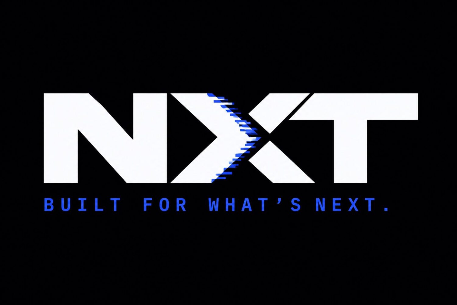
Built for what’s next.
NXT
Problem
Every platform in this market claims to be the future, in the same gradient, using the same vocabulary. NXT had a genuinely differentiated product and an identity that filed it alongside companies it had already overtaken. It needed a brand that felt like engineering rather than marketing, and one built for motion, because most of its audience meets it in a product demo or a scroll rather than on a page.
Strategy
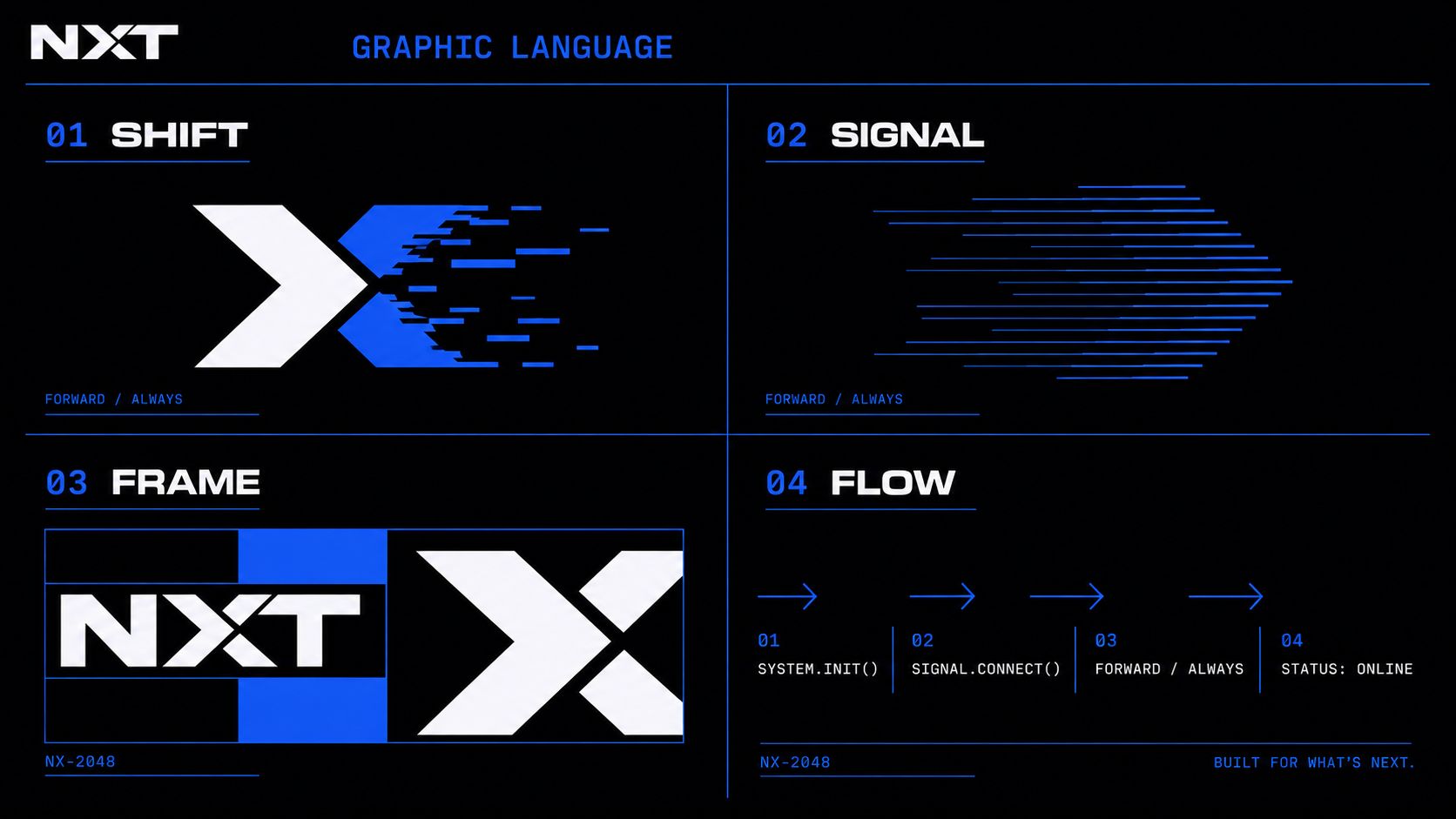
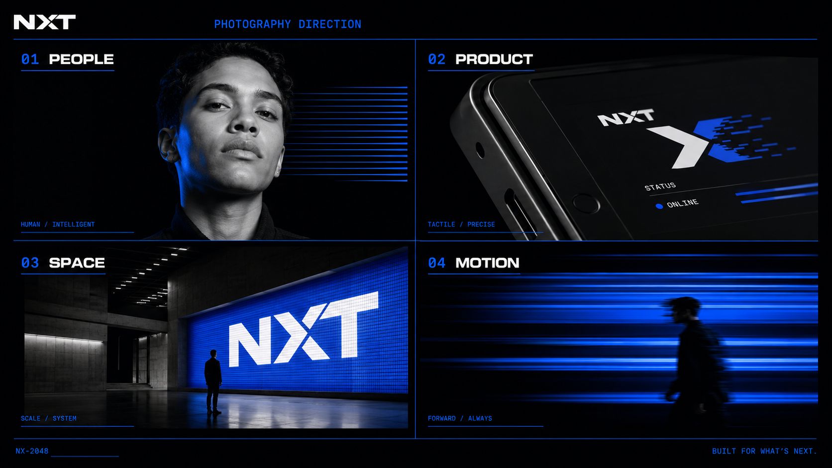
Built for what’s next. This is deliberately the opposite of a considered professional mark , futuristic, energetic, intelligent and disruptive, led by motion rather than layout. The graphic language is four moves and no more: Shift, a controlled right-moving pixel displacement; Signal, horizontal scan-line arrows; Frame, modular cropping of the identity; and Flow, disciplined forward navigation. Colour is locked to electric cobalt, near black and cool white so the system cannot drift as the product ships, and photography stays monochrome under controlled cobalt light , people intelligent, product precise, space systematic, motion always forward.
What we built
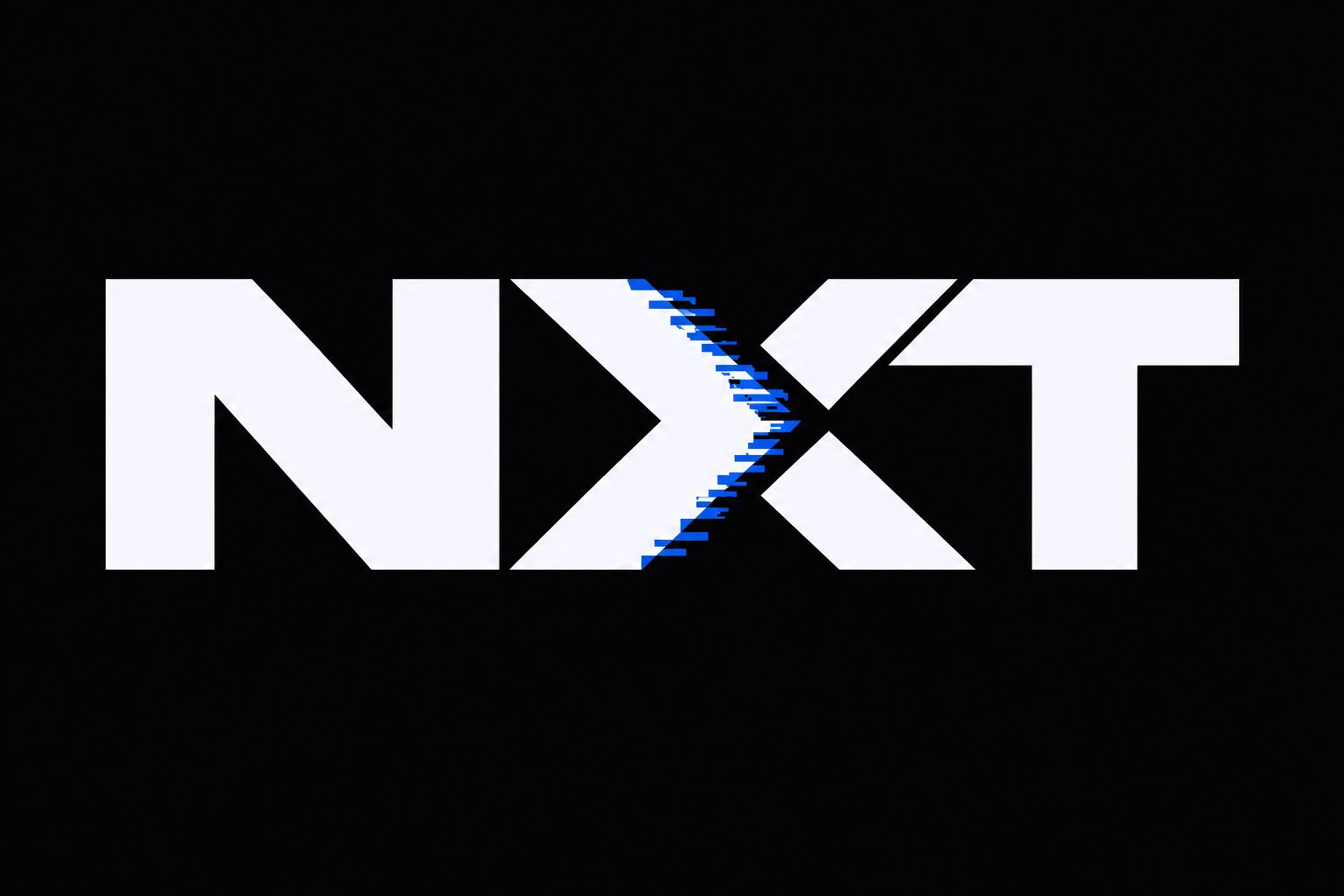
- Primary logoThe custom geometric wordmark in white and cobalt on a solid black background.
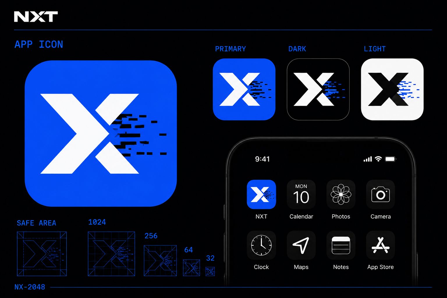
- App iconThe approved X becomes the app icon across primary, dark and light versions, with construction and small-size tests.
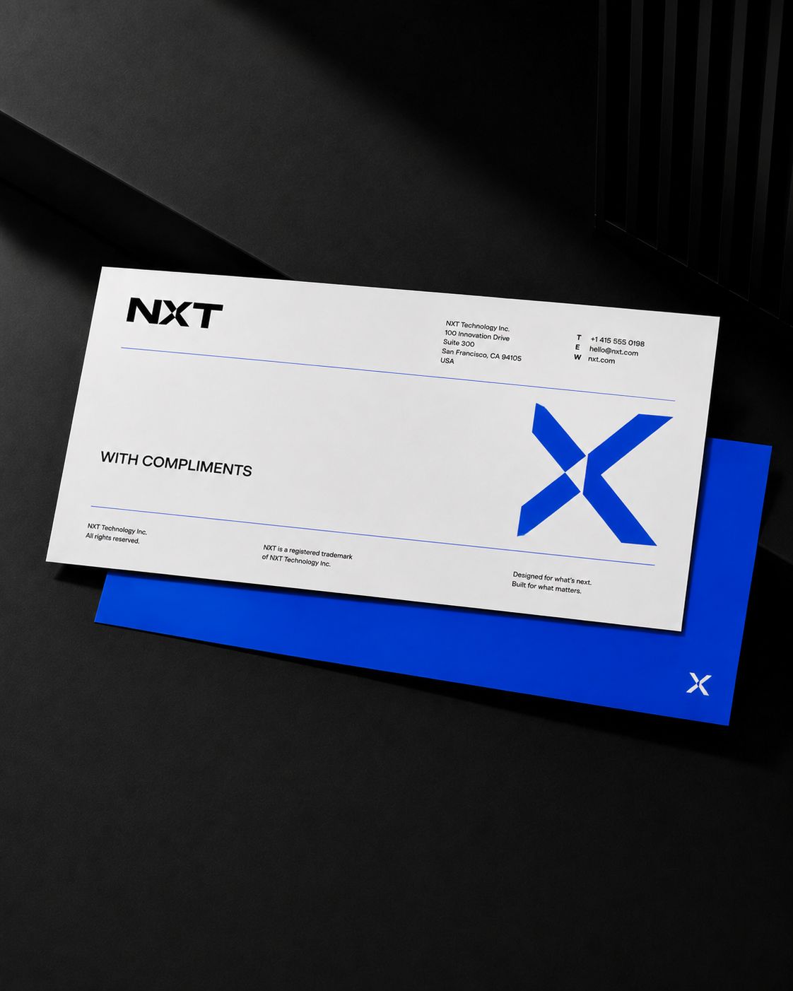
- LetterheadConsistent electric blue, black and white branding with the bold X graphic.
- Compliment slipConsistent with the letterhead and established blue X identity.
- Standalone wordmark
- N symbol
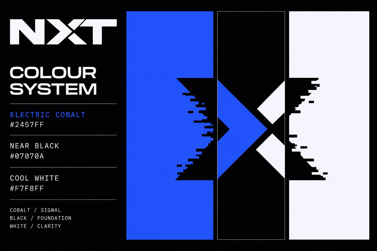
- Colour palette
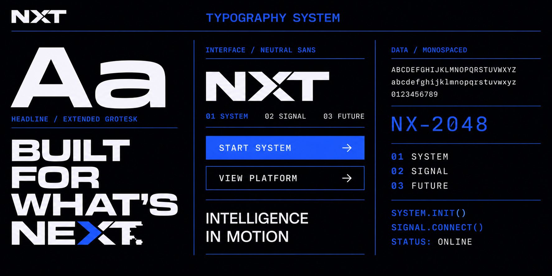
- Typography system
- Graphic language
- Digital patterns
- Photography direction
- Business cards
- Employee ID card
- Notebook and accessories
- Product packaging
- Branded technology device
- Office exterior signage
- Reception signage
- Office environmental graphics
- Digital wayfinding
- Website homepage (desktop)
- Website homepage (mobile)
- Product page
- Pricing page
- App onboarding screens
- App dashboard
- Mobile app interface
- Data visualisation screen
- Digital advertisement
- Social media campaign
- Outdoor advertising
- Motion-graphics frame
- Launch-event stage
- Exhibition stand
- Staff clothing
- Branded merchandise
Brand system
- Electric Cobalt #2457FF
- Near Black #07070A
- Cool White #F7F8FF
- Typography
- Extended geometric grotesk for headlines, a neutral sans serif for interfaces, and monospaced type for data and system information.
- Graphic language
- Shift , controlled right-moving pixel displacement. Signal , horizontal scan-line arrows. Frame , modular cropping of the identity. Flow , disciplined forward navigation.
- Photography direction
- People human and intelligent, product tactile and precise, space monumental and systematic, motion always forward. All imagery monochrome with controlled cobalt light only.
The work

Result
The identity behaves like the product. The displaced X, the scan-line arrows and the modular crops were drawn for motion first, so the brand survives a product demo, a scroll and an app icon rather than only a page. Monochrome discipline and a single cobalt signal keep it recognisable across an interface, a conference stand and a piece of data.